
BRANDAS A PLACE
THE ORGANIZING IDEA
Your brand should get out more.
A brand should shape the space, the materials, the rituals, the service, and the memory people leave with. A logo belongs on some of it. Thought belongs in all of it.
LESS TALK. MORE SHOW.
Here’s what
I mean.
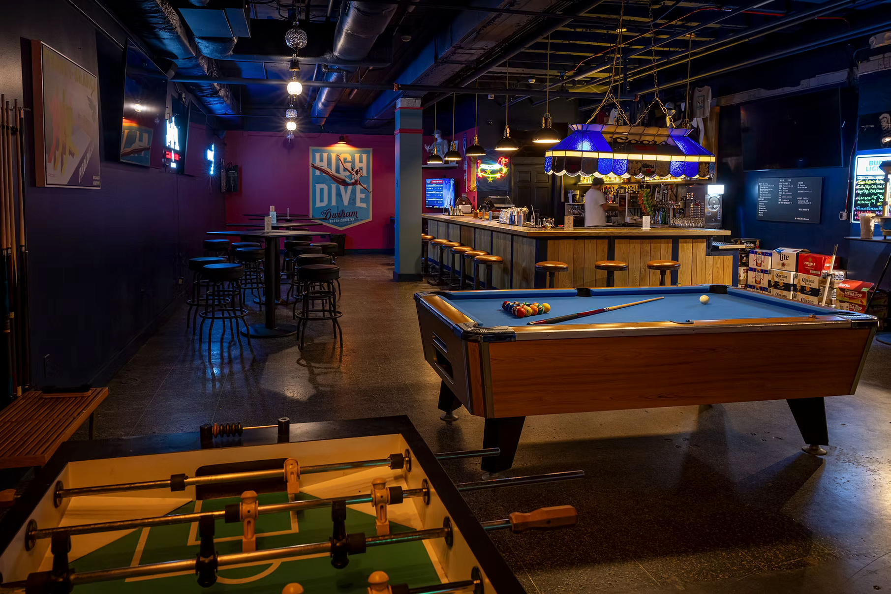
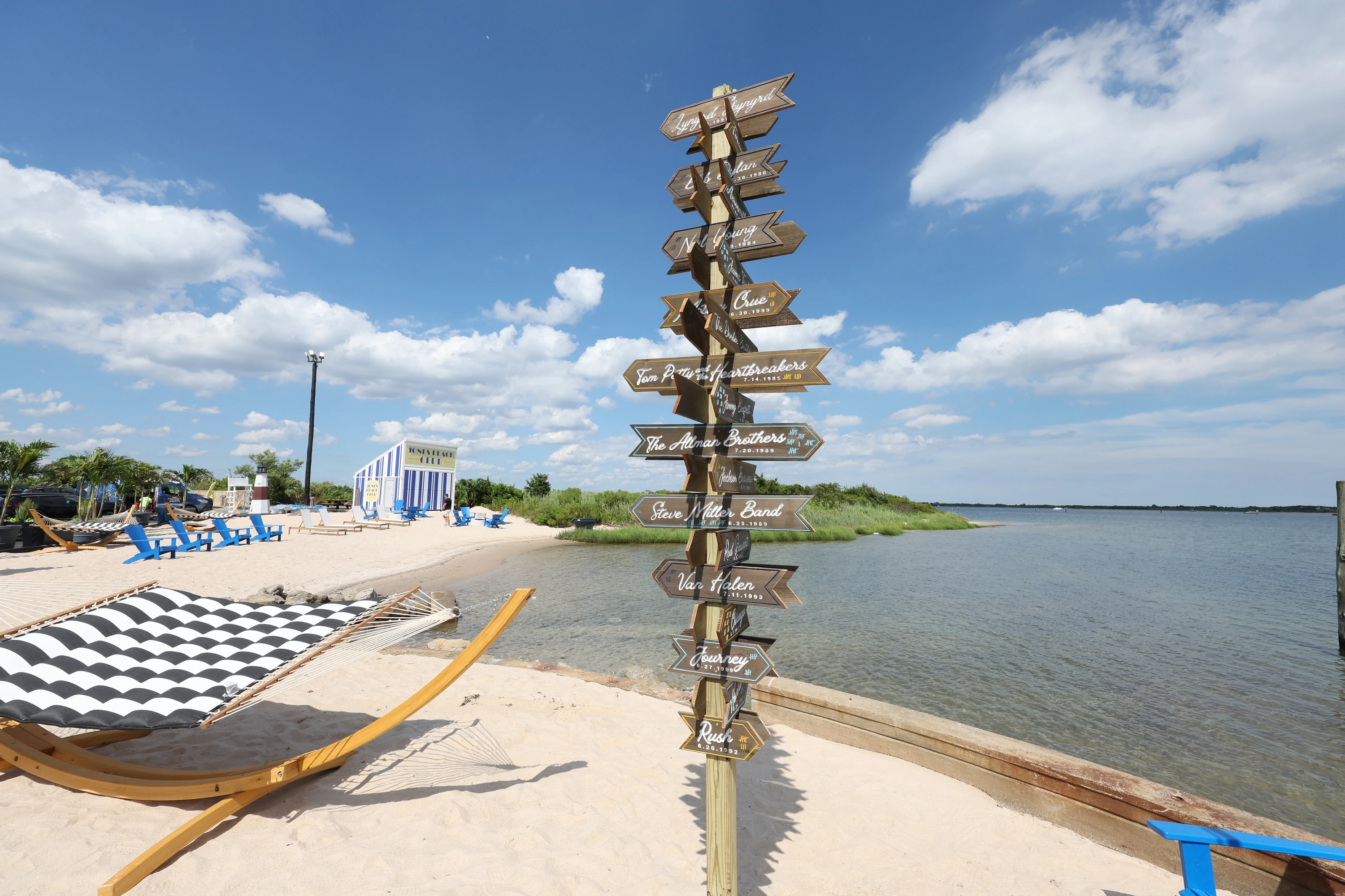
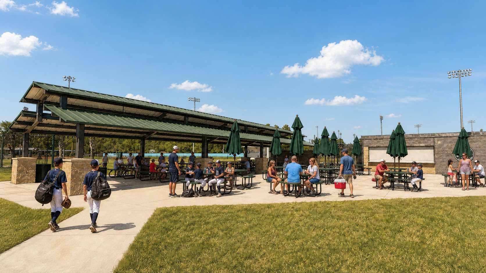
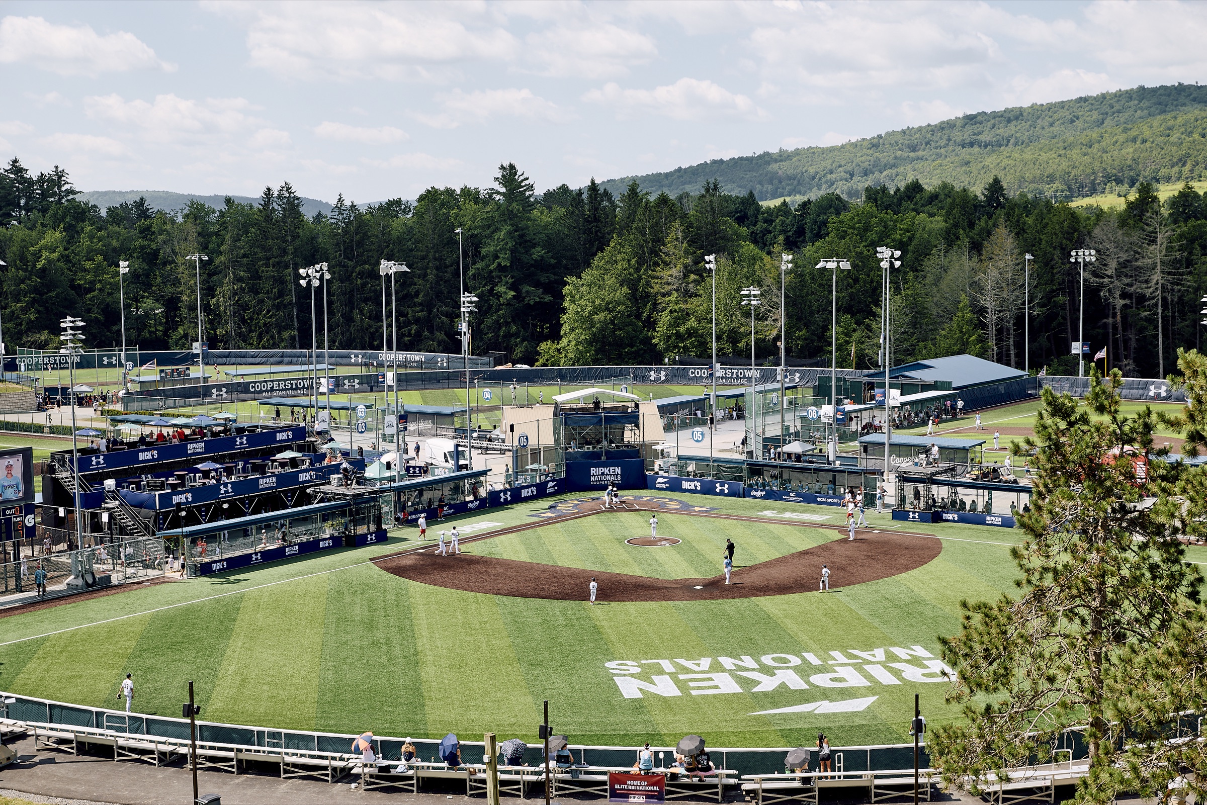
Good in a deck.
Better in person.
A few ideas that got out of hand. And into the real world.
01 / FORAGE & FEAST
A concept that became a destination.
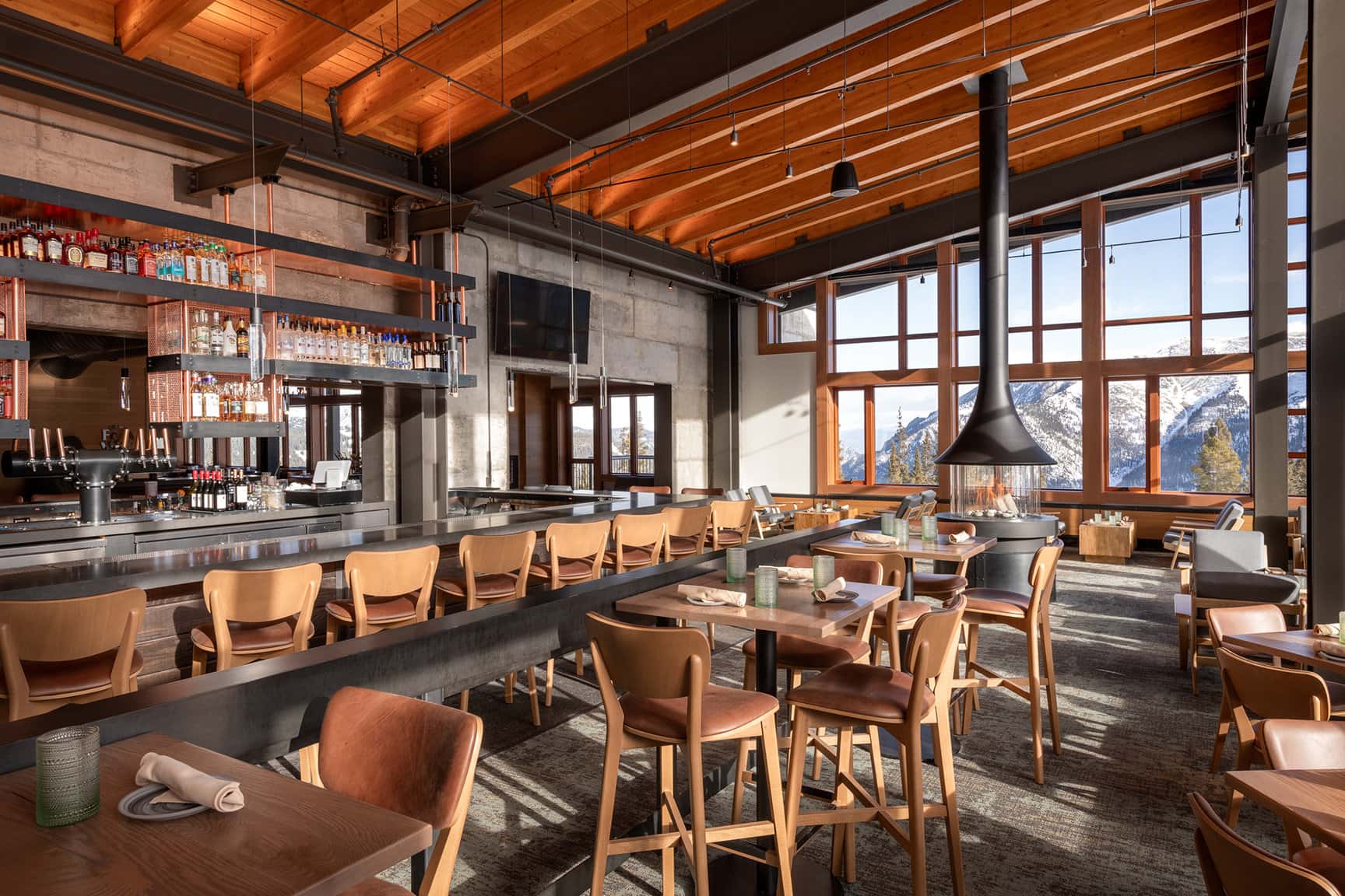
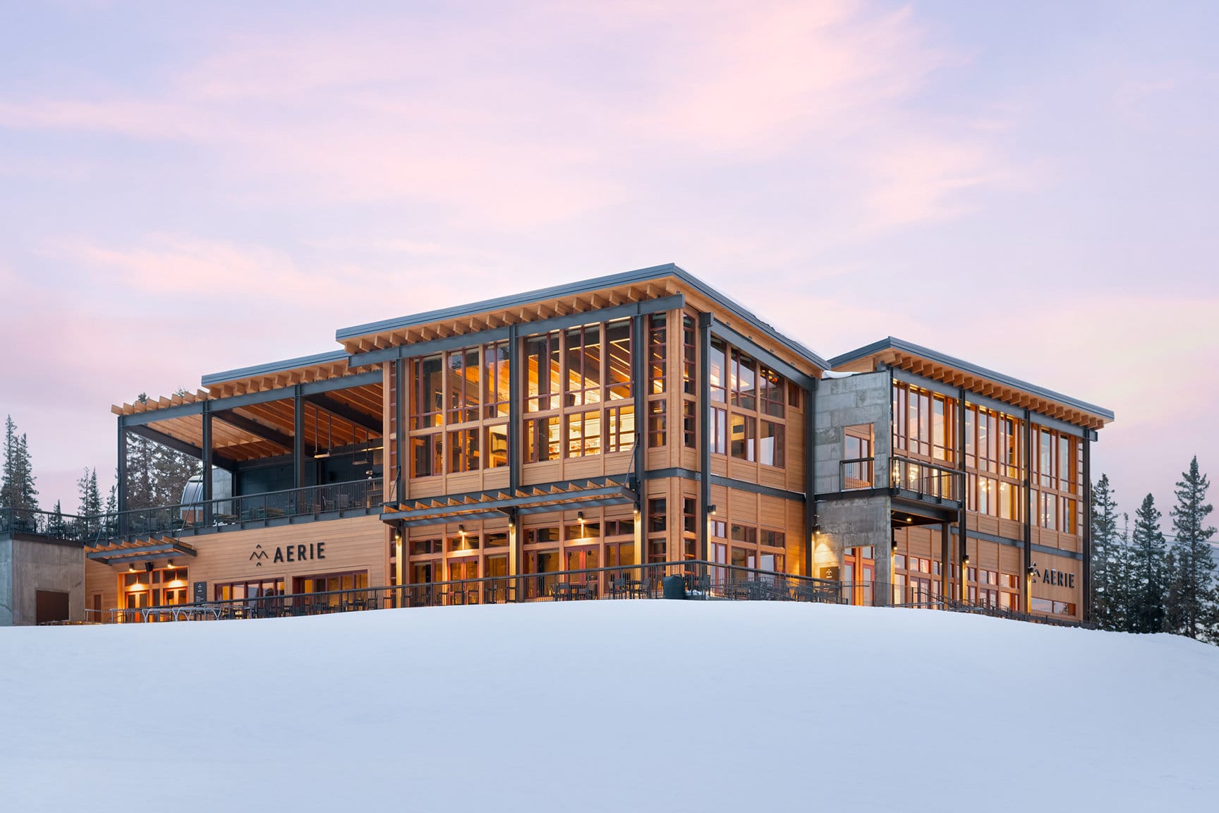
Forage & Feast lives inside Aerie at Copper Mountain. The identity was built to belong to the architecture, the altitude, and the experience—warm, elevated, and unmistakably of the place.
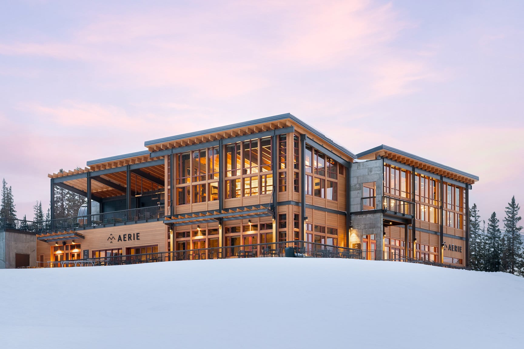
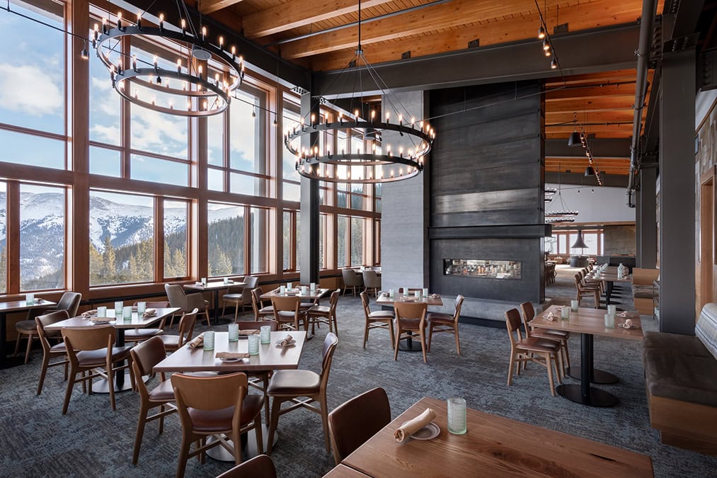
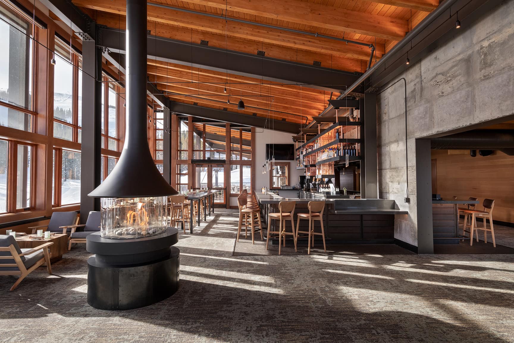
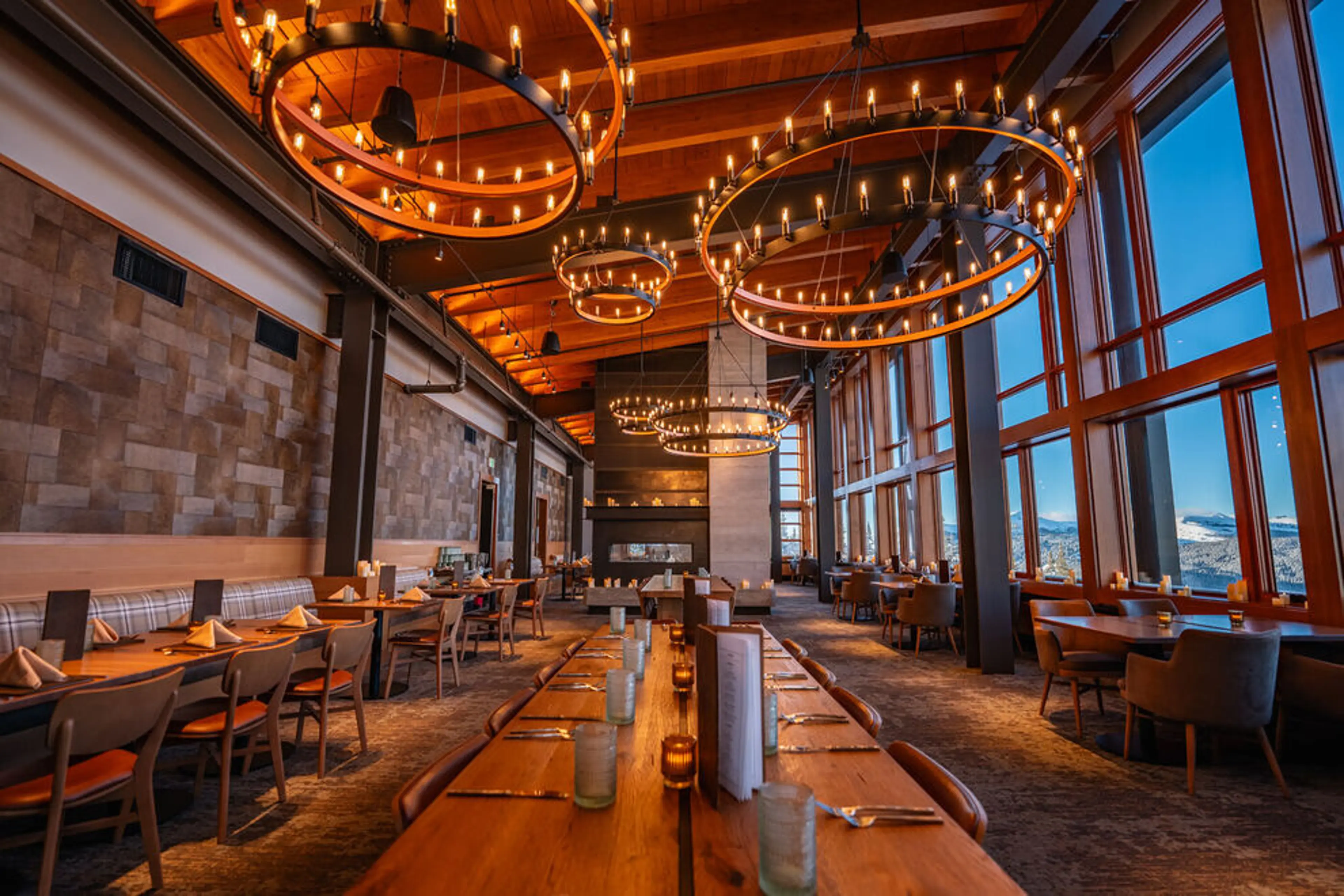
Somewhere between designing the wayfinding and opening a $40 million lodge, the materials became the whole story. That took almost a decade.
RoleCreative direction + identity + brand experience
ScaleMountaintop hospitality destination
ThroughlineConcept → identity → built experience
02 / BOULDERING PROJECT
Build belonging into the room.
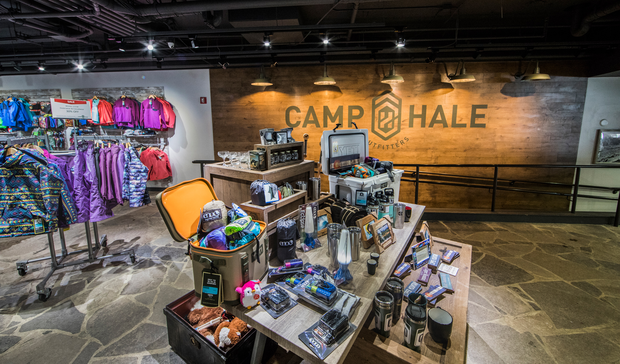
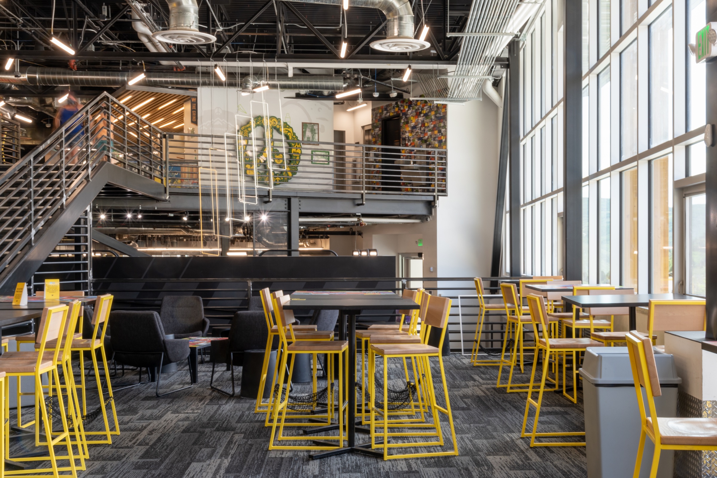
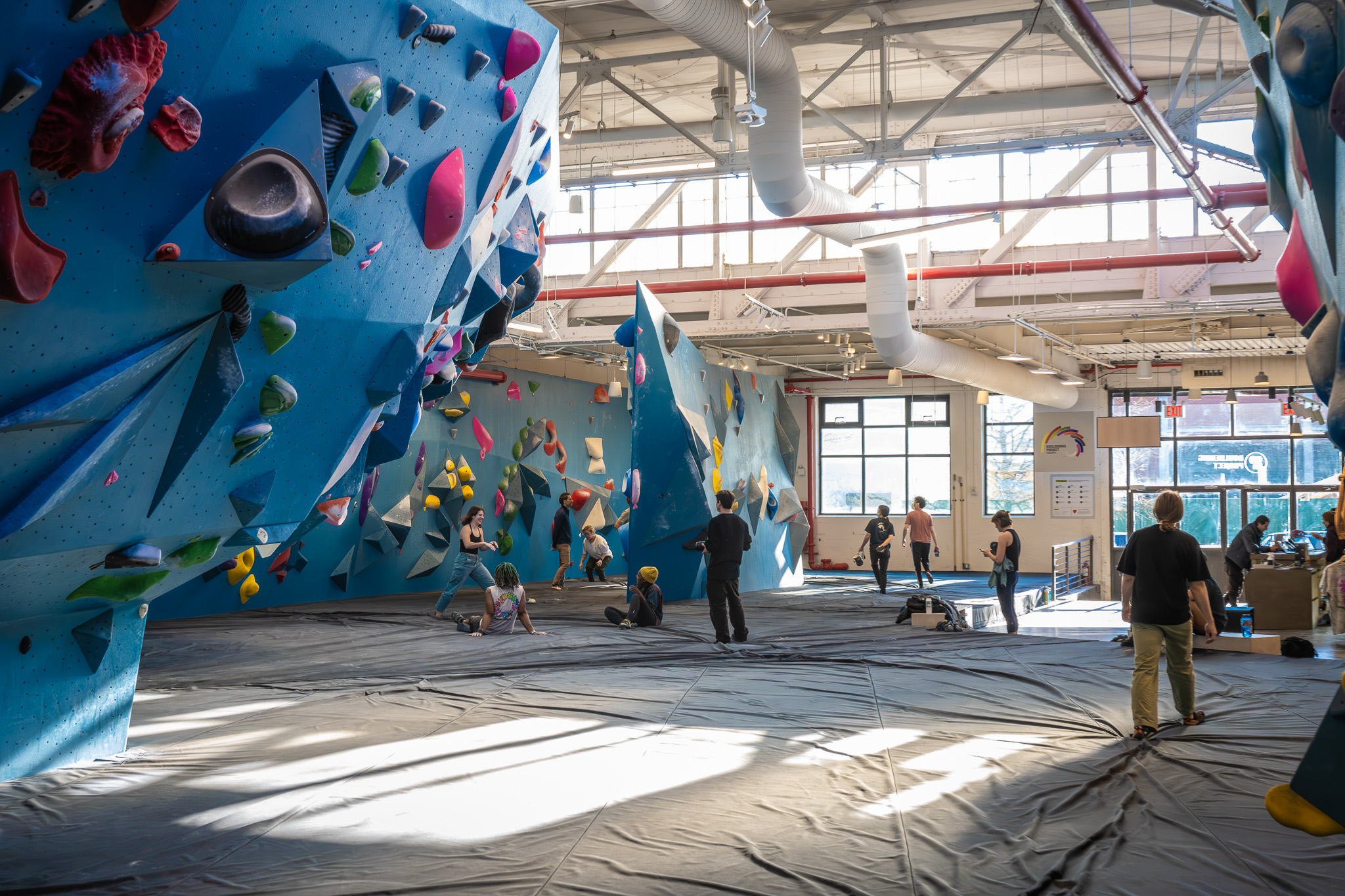
Three gyms to twenty-five in five years. Keep the culture. Create consistency. Don’t look corporate. A modest little rebrand.
Bouldering Project had a decade of community and a brand you needed local knowledge to find. I built an enduring visual identity and systems across every touchpoint—from signage and wayfinding to the spaces themselves. Enough structure to scale. Enough freedom to keep twenty-five gyms from feeling like a franchise.
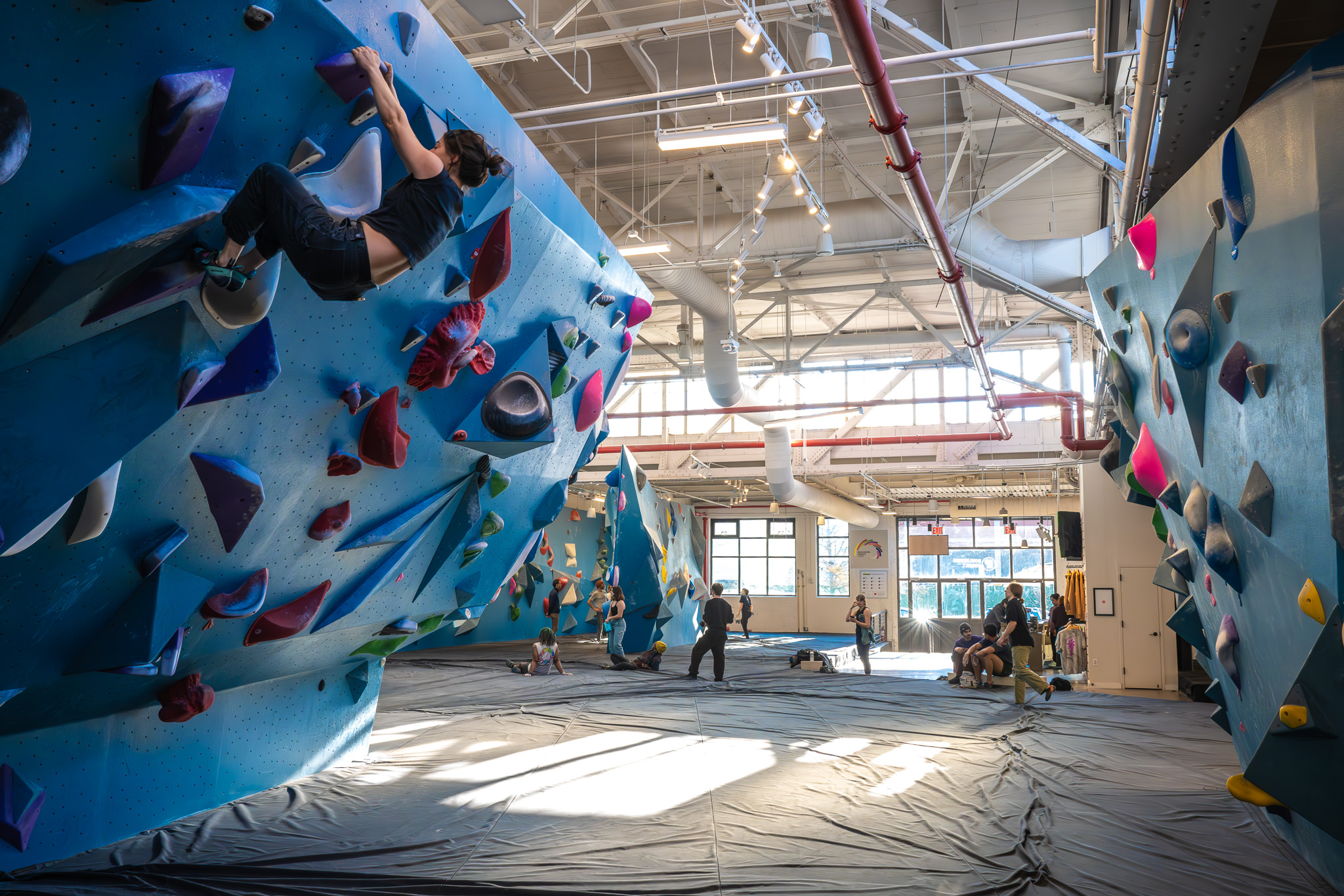
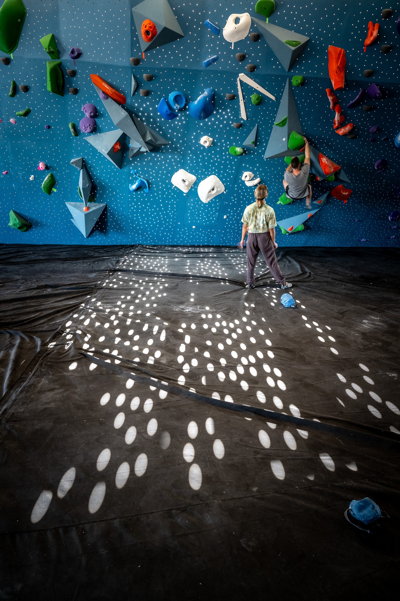
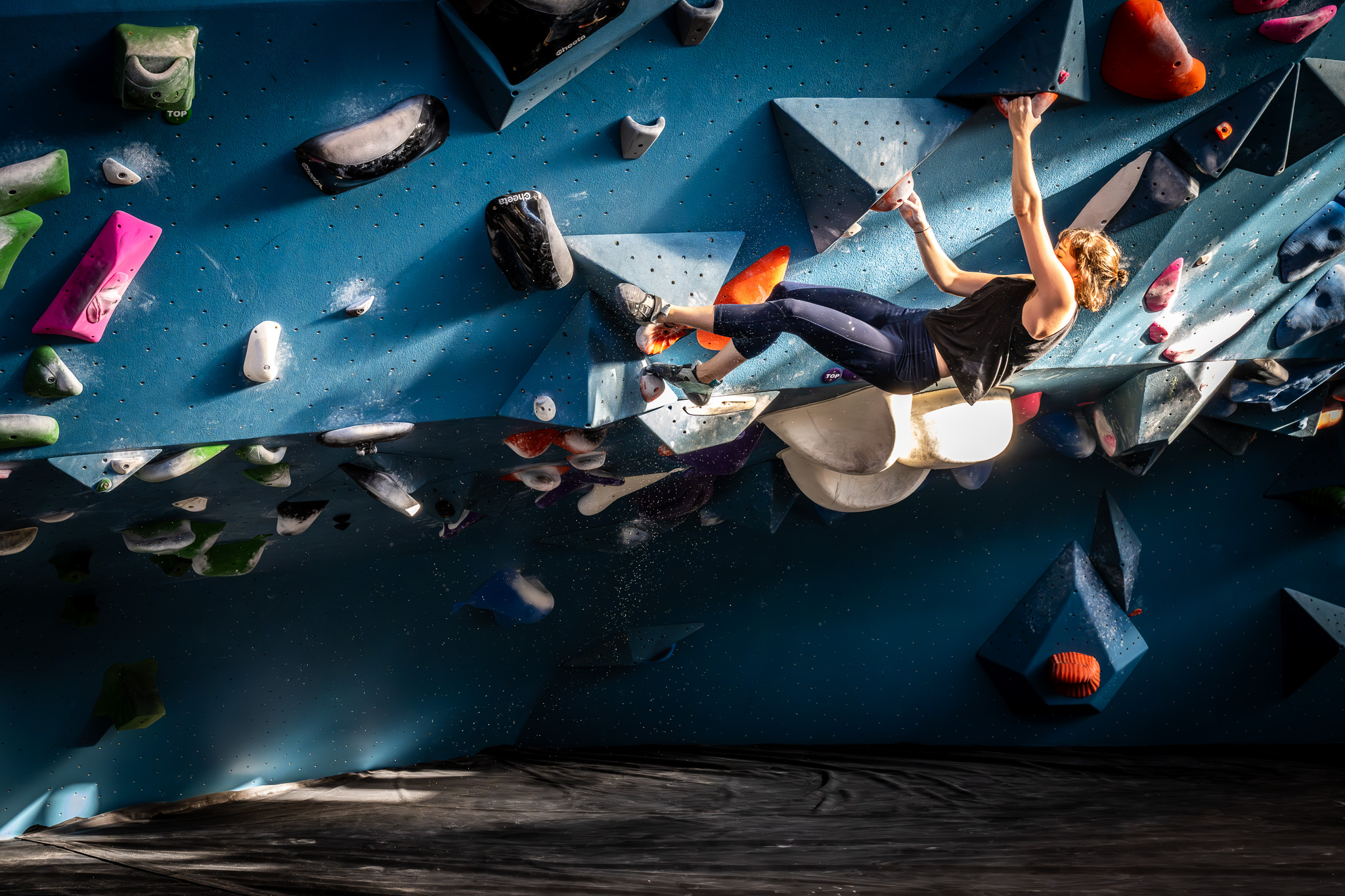
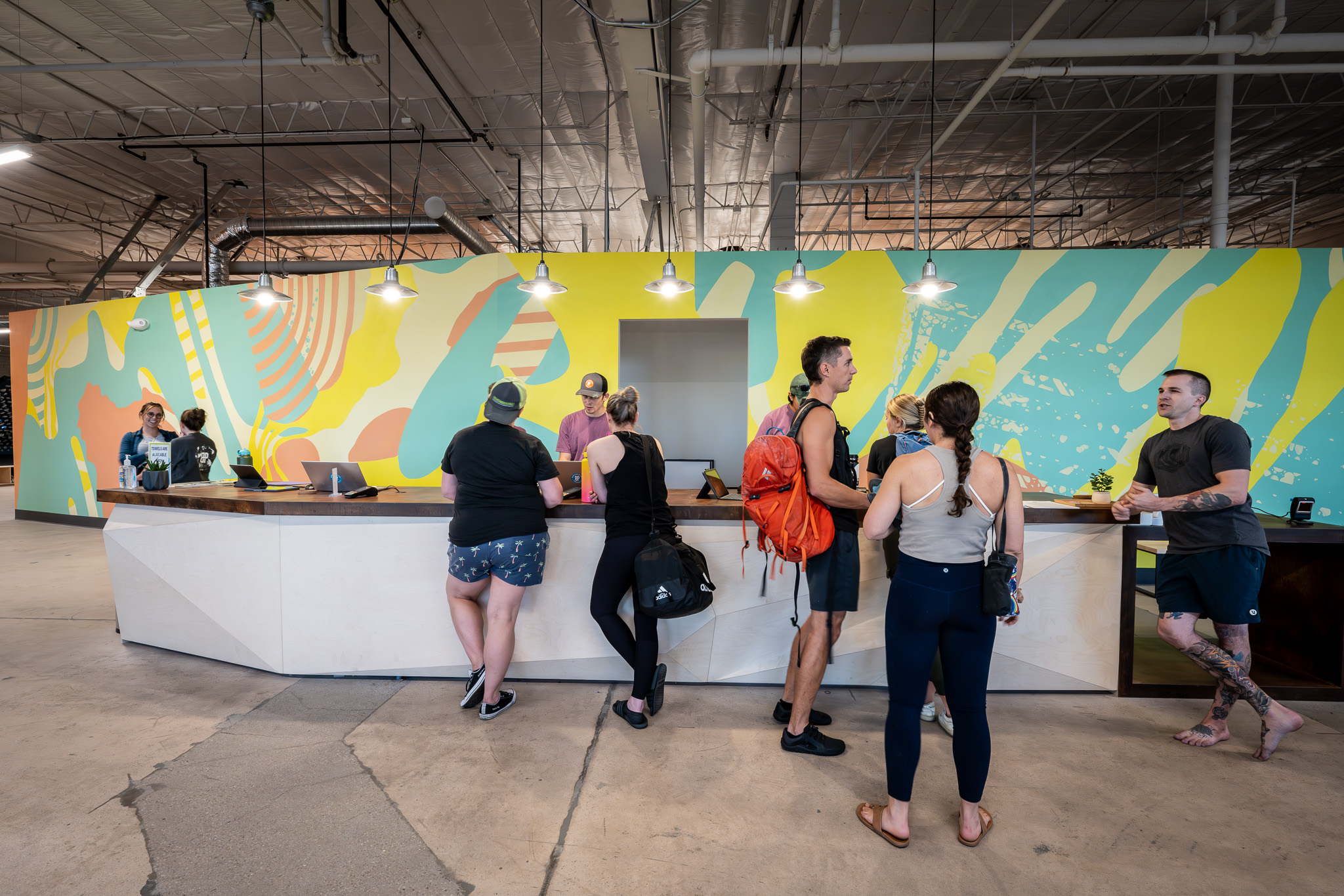
The walls, color, experience, and community came first, the The identity and wayfinding followed.
RoleCreative direction + identity + environmental system
ScaleMulti-location community brand
ThroughlineLogo → system → space → belonging
03 / SUBARU WINTERFEST
A brand promise. Built to travel.
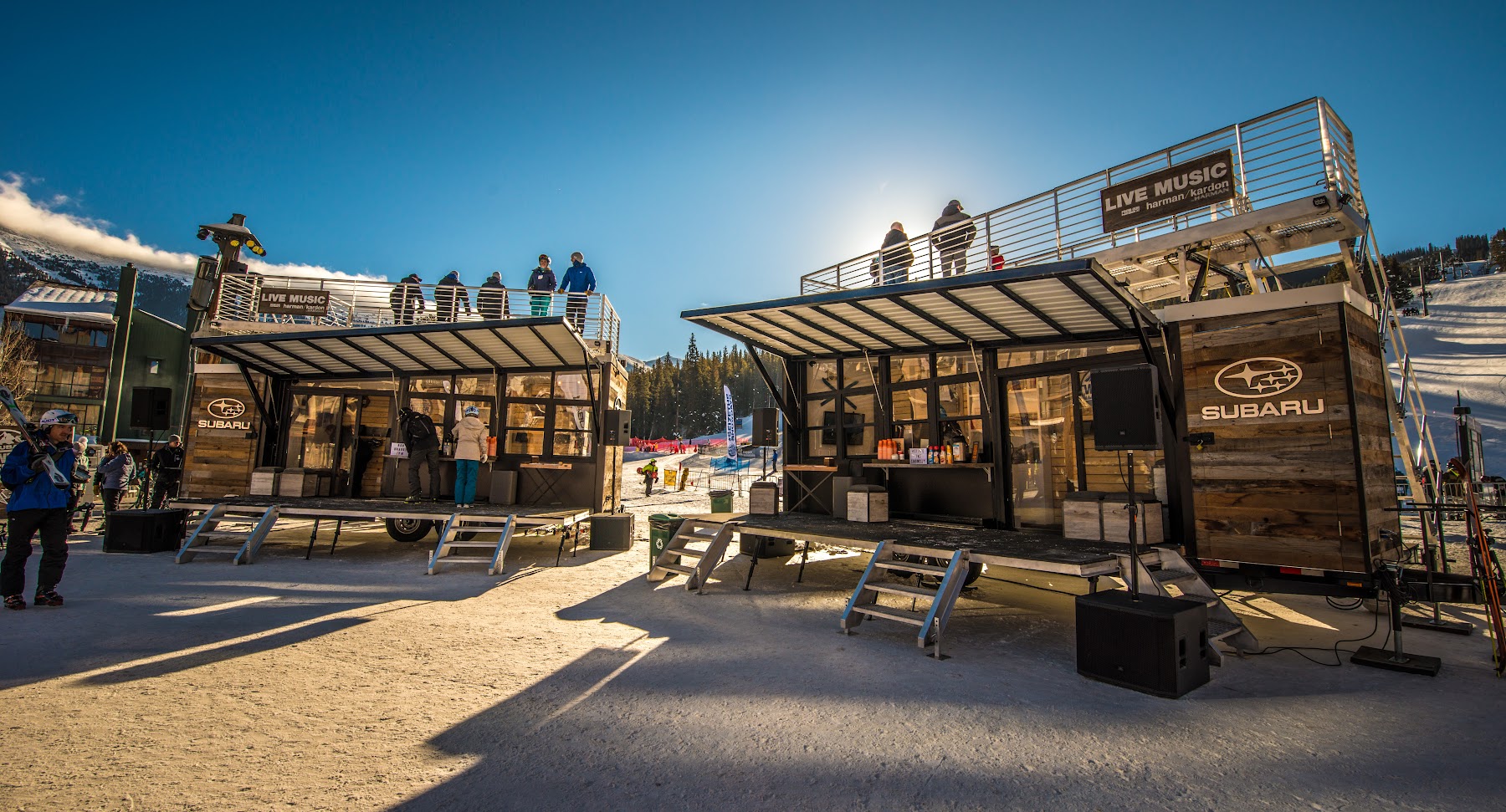
The WinterFest identity became a modular winter experience built to feel specific, premium, and alive at every mountain—while surviving weather, production schedules, transportation, and thousands of guests.
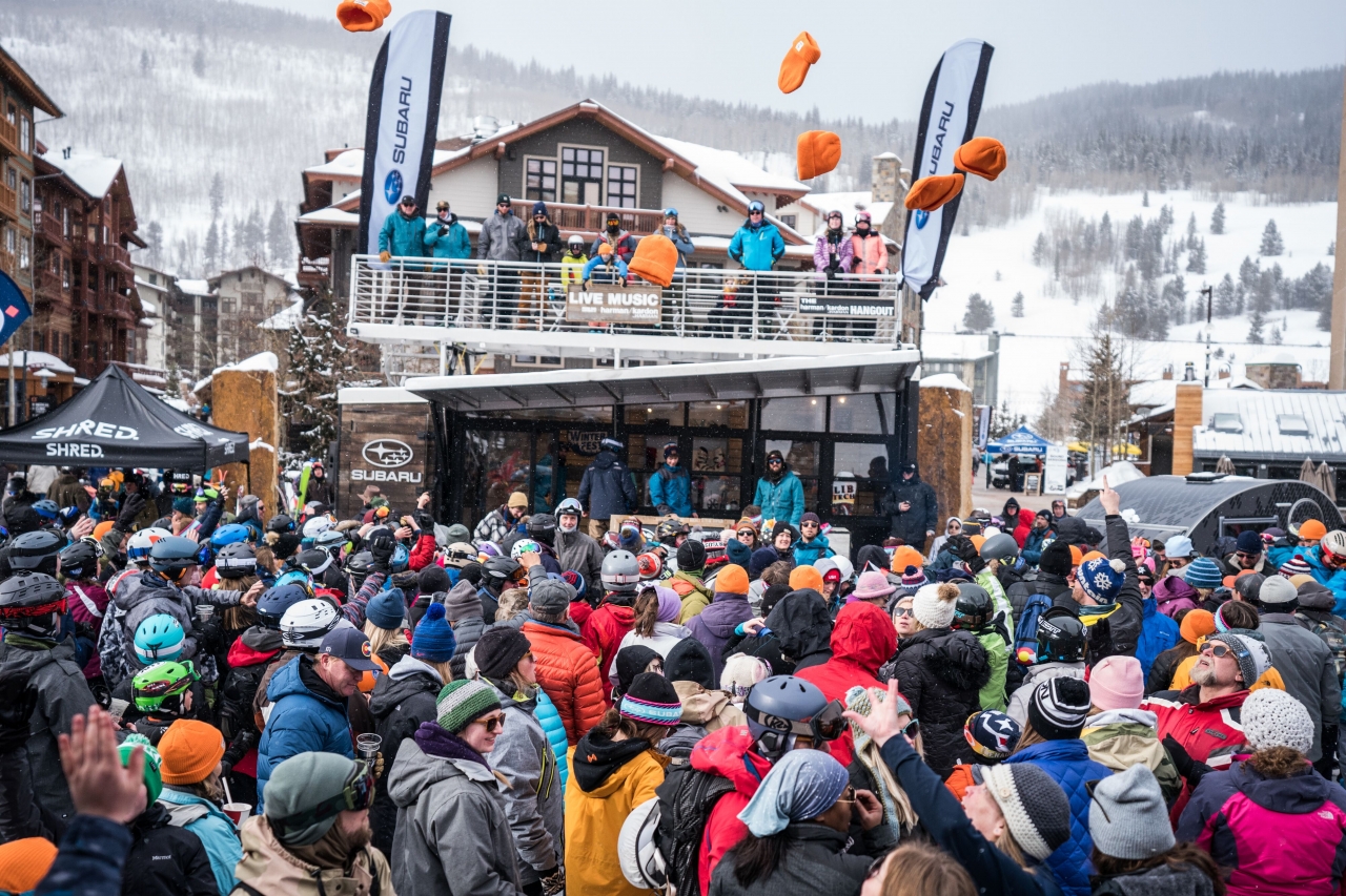
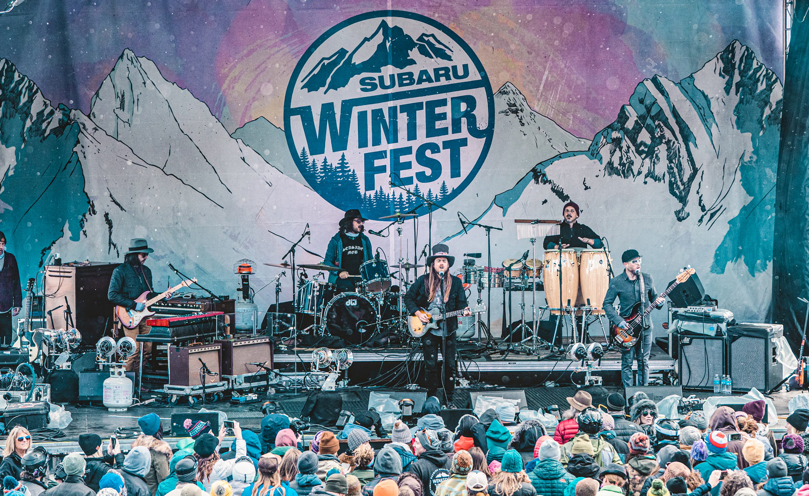
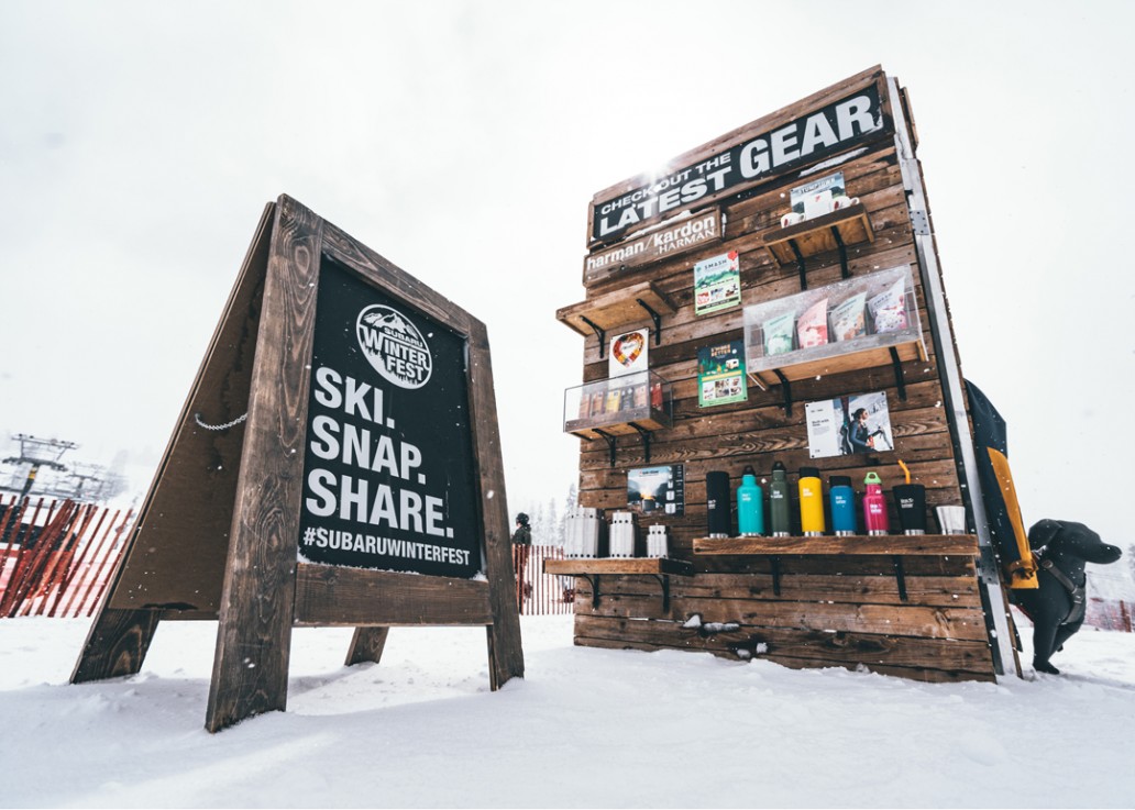
Creative direction that holds together at highway speed, at altitude, and in a snowstorm.
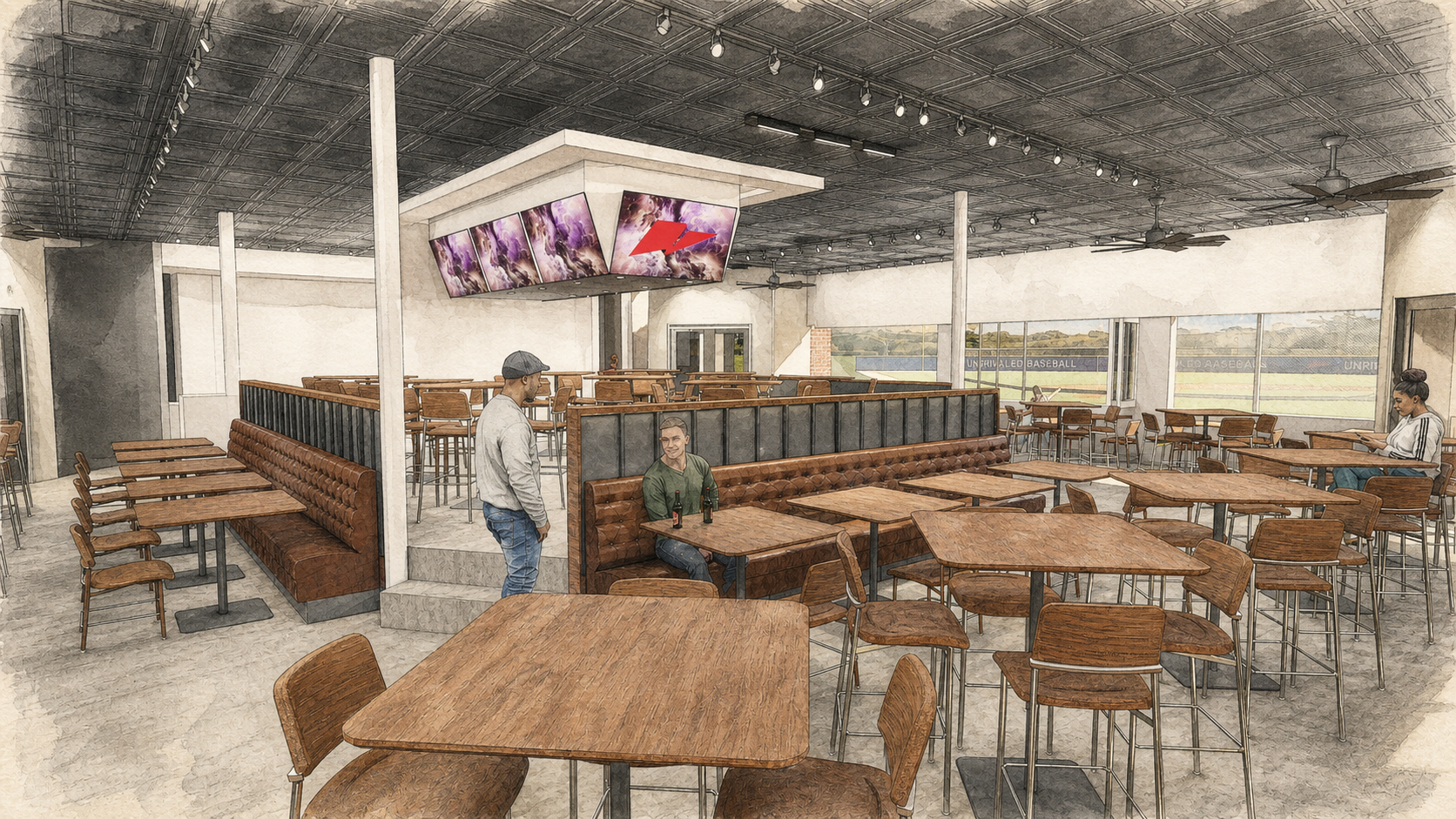
04 / UNRIVALED SPORTS PARK
CURRENTLY IN DEVELOPMENT / RENDERINGS INCOMING
A new world
is taking shape.
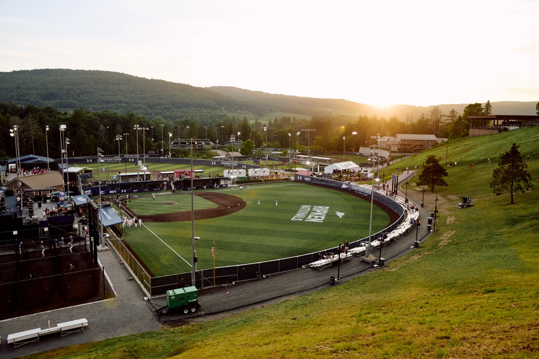
From identity to destination, a major sports platform is moving from vision to reality. This is the kind of assignment I’m chasing next: ambitious, operationally complex, and large enough for the brand to shape the entire experience.
05 / WOODWARD PARK CITY
Make the building behave like the brand.
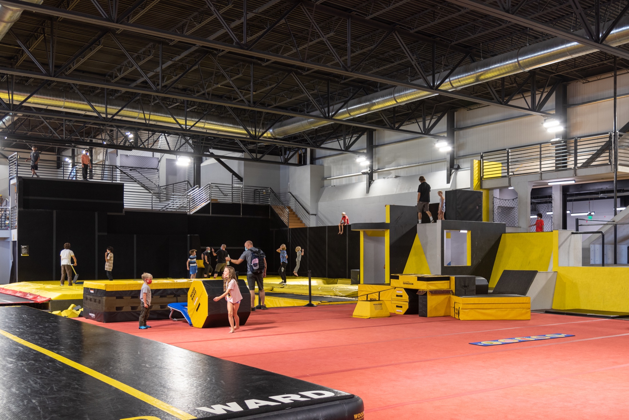
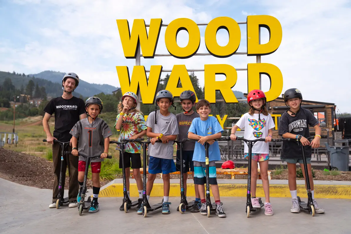
The identity expanded into a kinetic brand system carried through a massive action-sports environment—guiding arrival, movement, gathering, retail, and the energy of the experience itself.
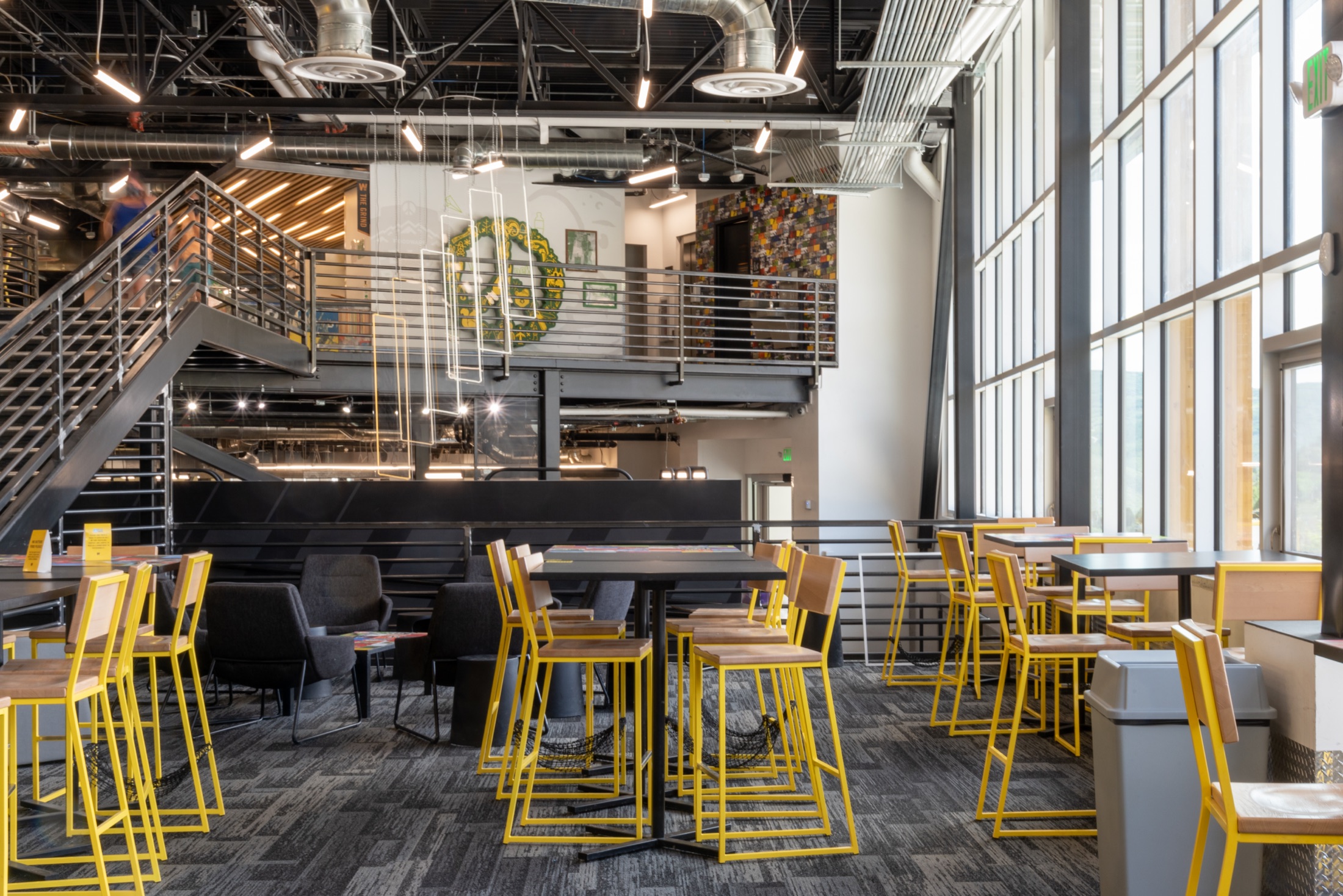
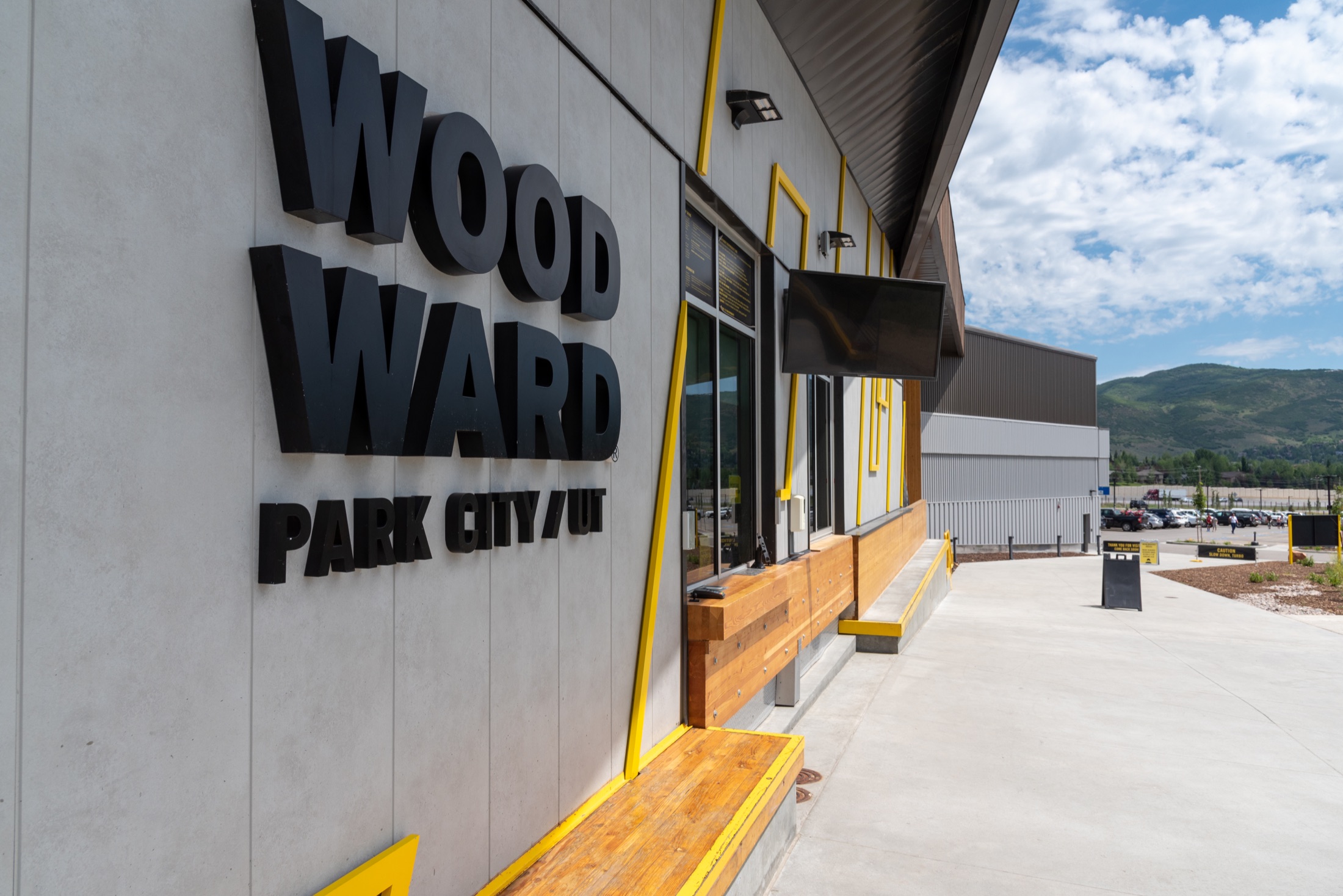
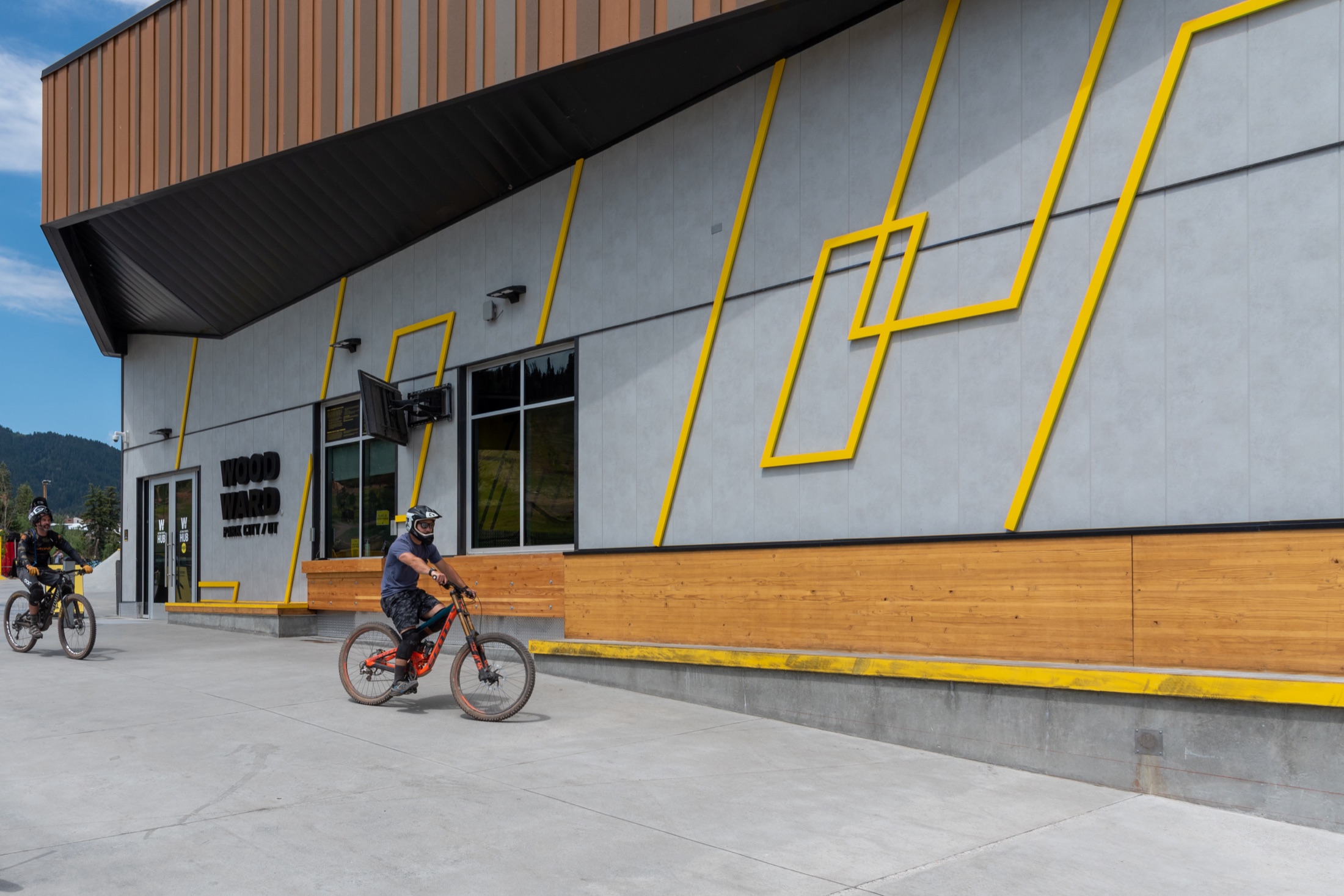
Brand as architecture. Architecture as experience.
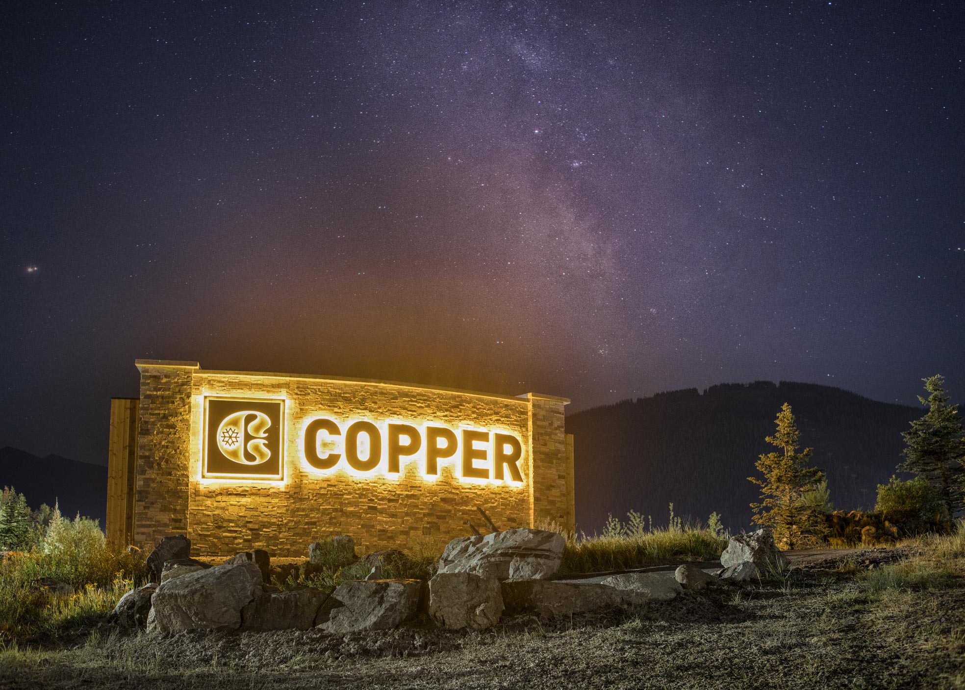
06 / COPPER MOUNTAIN
A village with a common language.
One identity connecting architecture, materials, wayfinding, hospitality, and daily operations. Built so we could come back in 25 years and say, “Yeah. We got that right.”
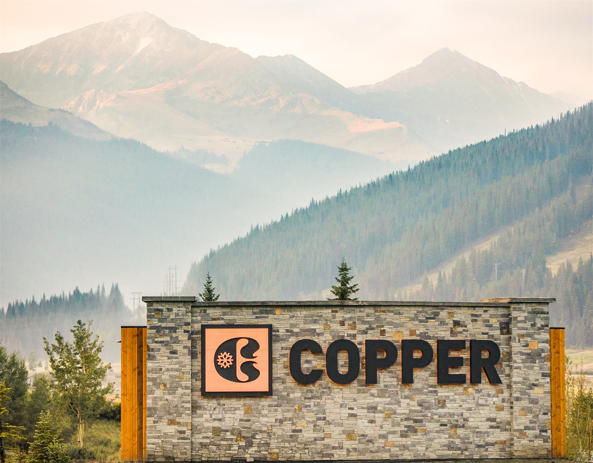
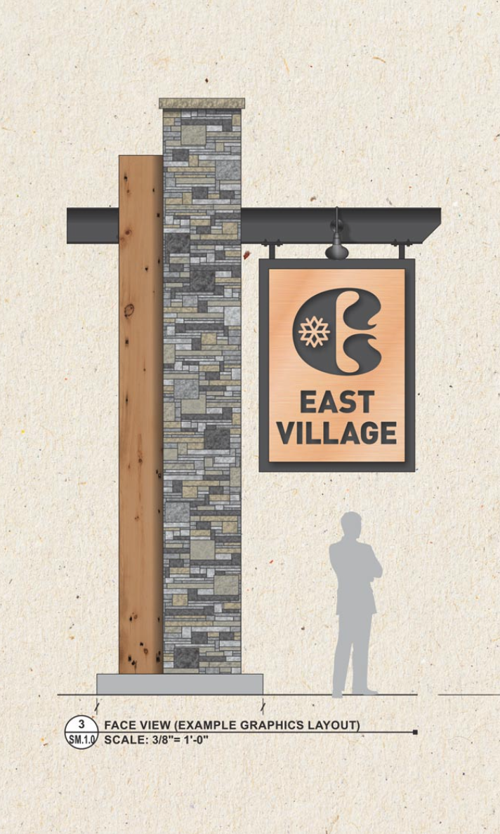
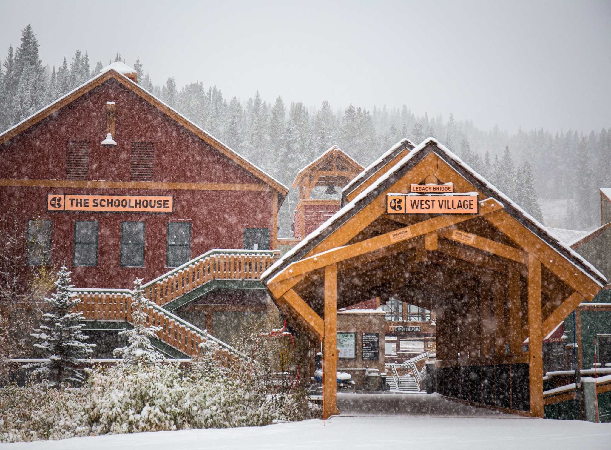
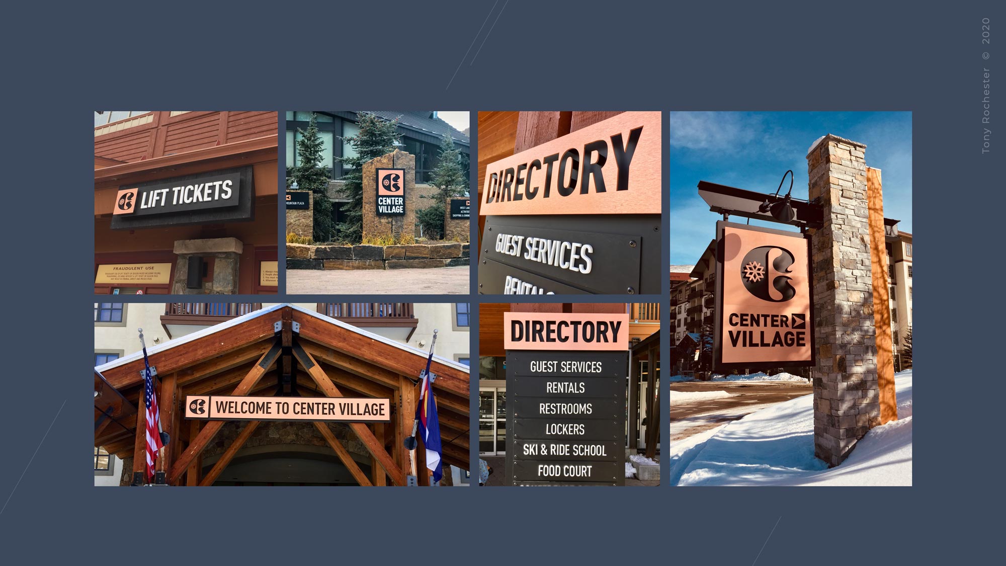
A decision made on a sign can turn up years later in a building. At Copper, those connections became the work.
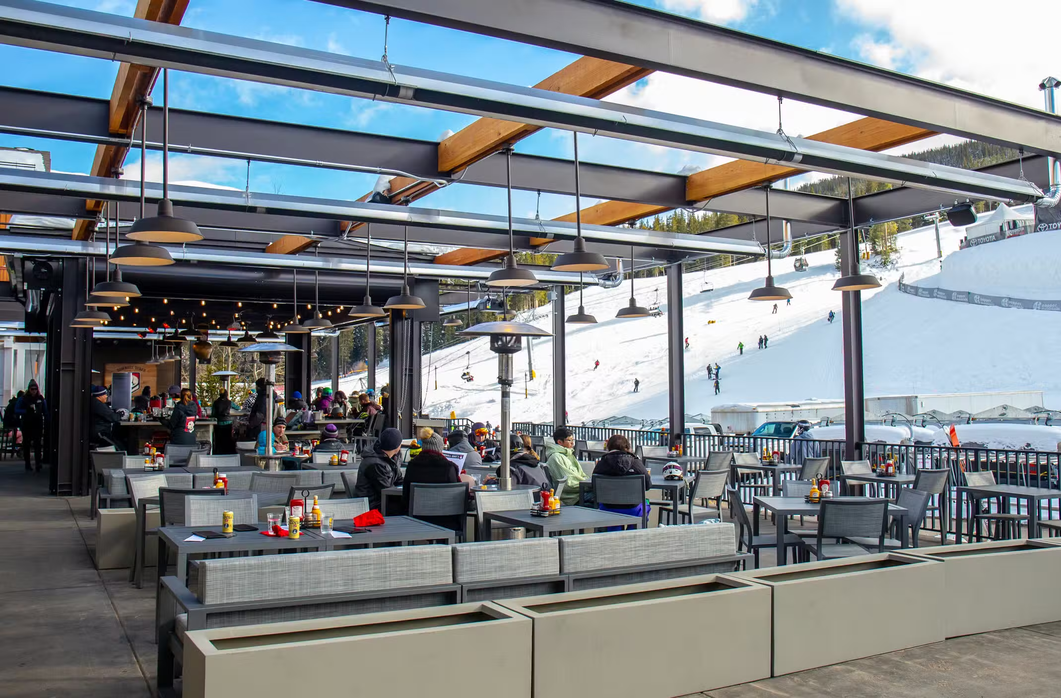
07 / DOWNHILL DUKE’S
Après with its own point of view.
We turned his story into a personality for a failing umbrella bar. “Never eat yellow snow.” “I went downhill with Duke.” “I got high with Duke. 9,140’.” From the room to the dog-friendly patio to the bumper stickers, Duke had something to say. The bar became the star of the mountain base.
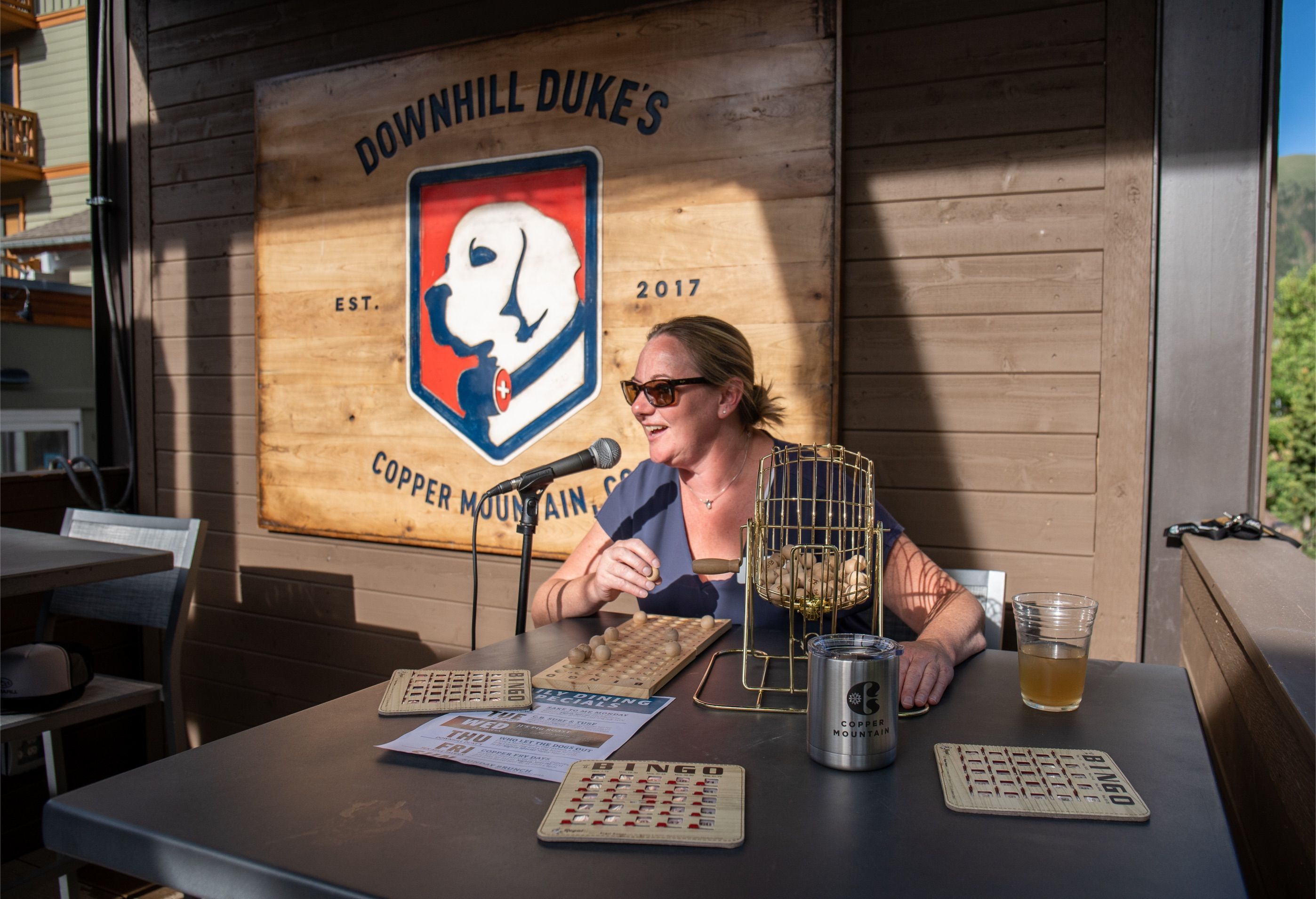
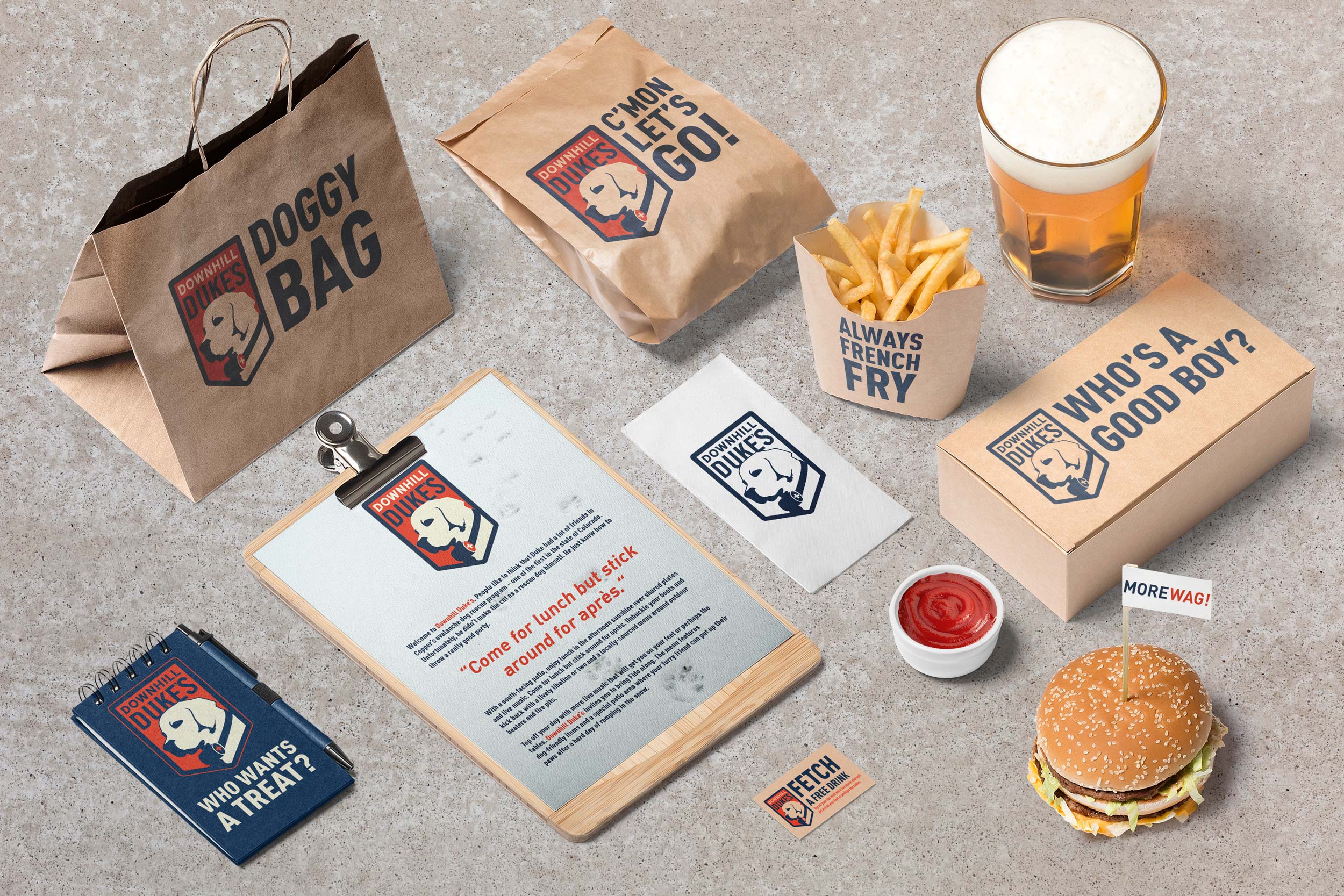
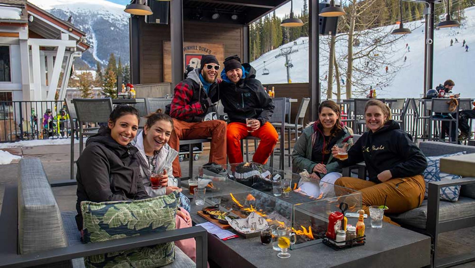
An unsuccessful avalanche dog. An unsuccessful umbrella bar. Together, considerably more successful.
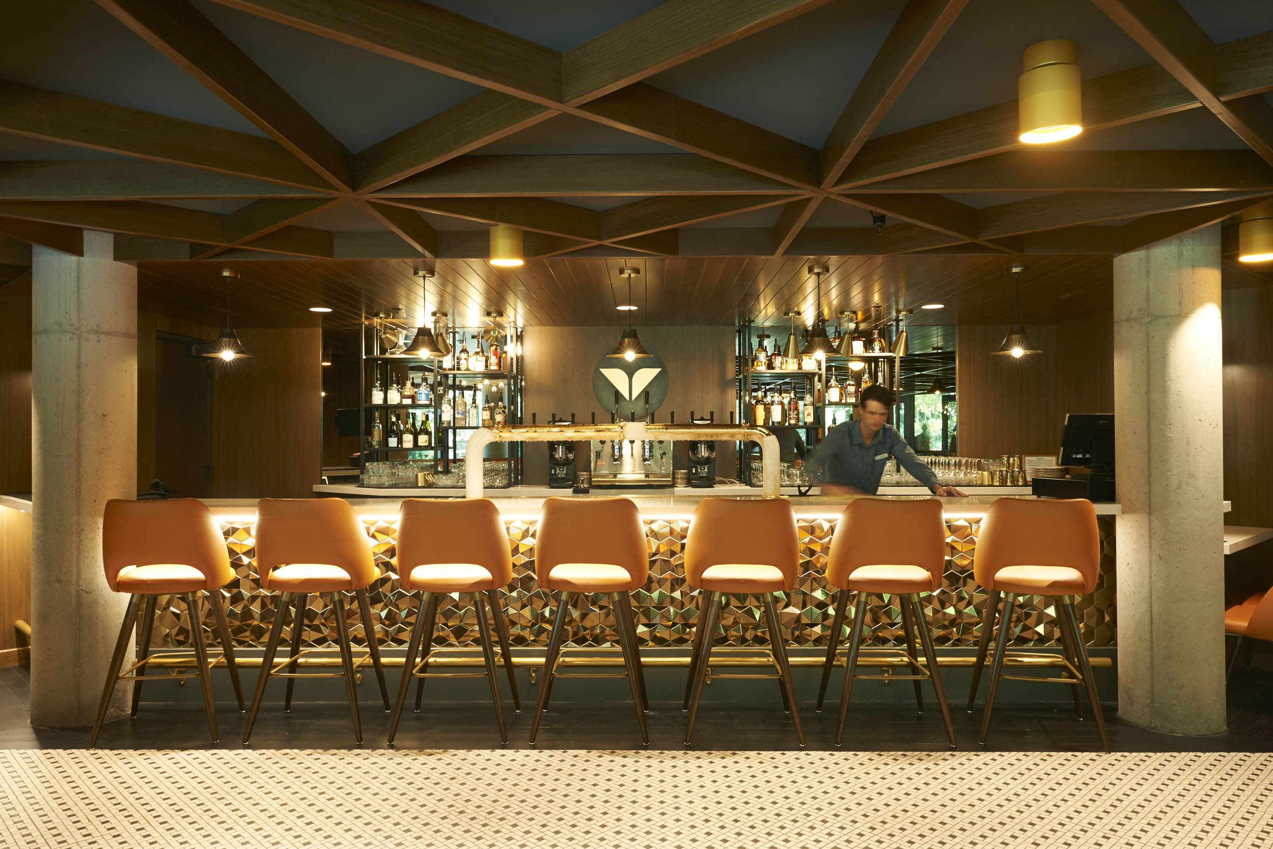
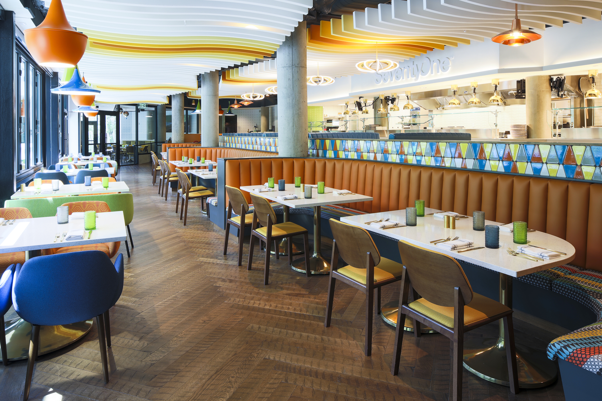
08 / SEVENTYONE AT SNOWBIRD

History, translated into hospitality.
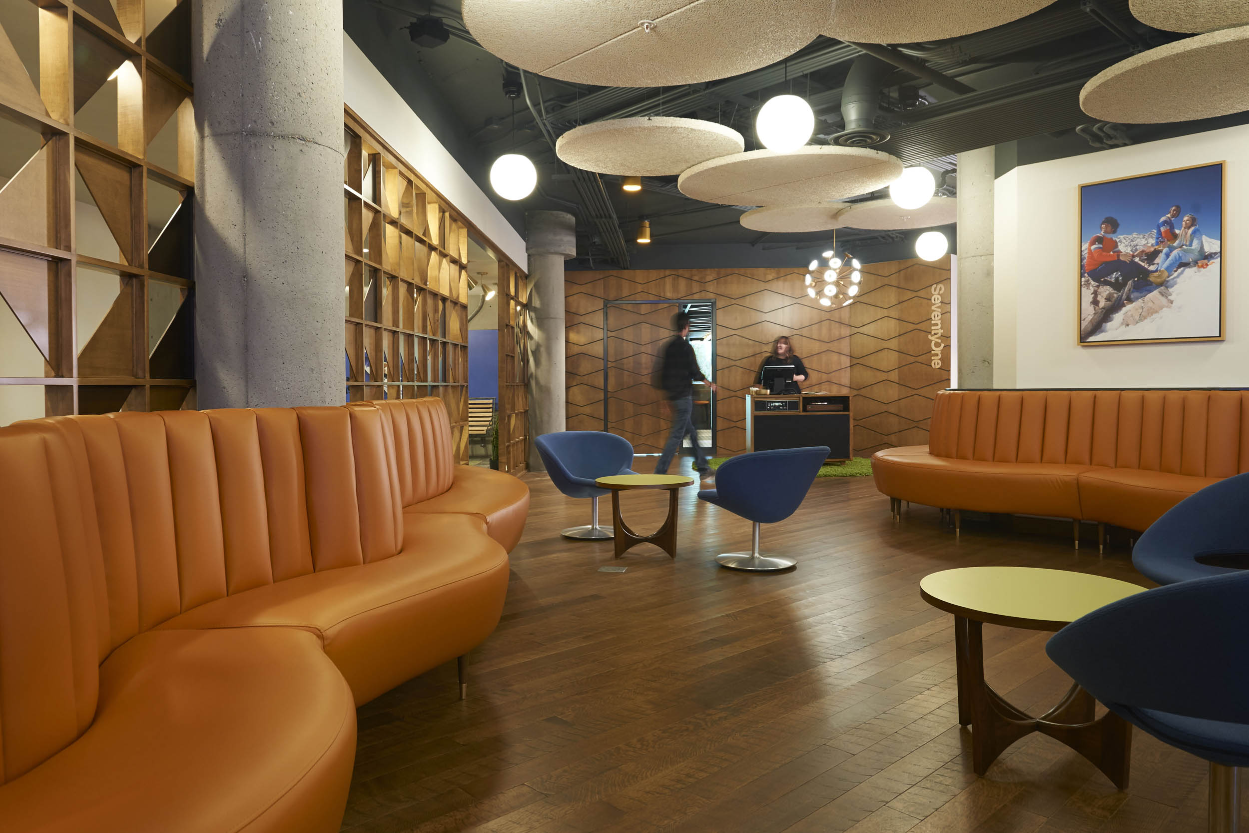
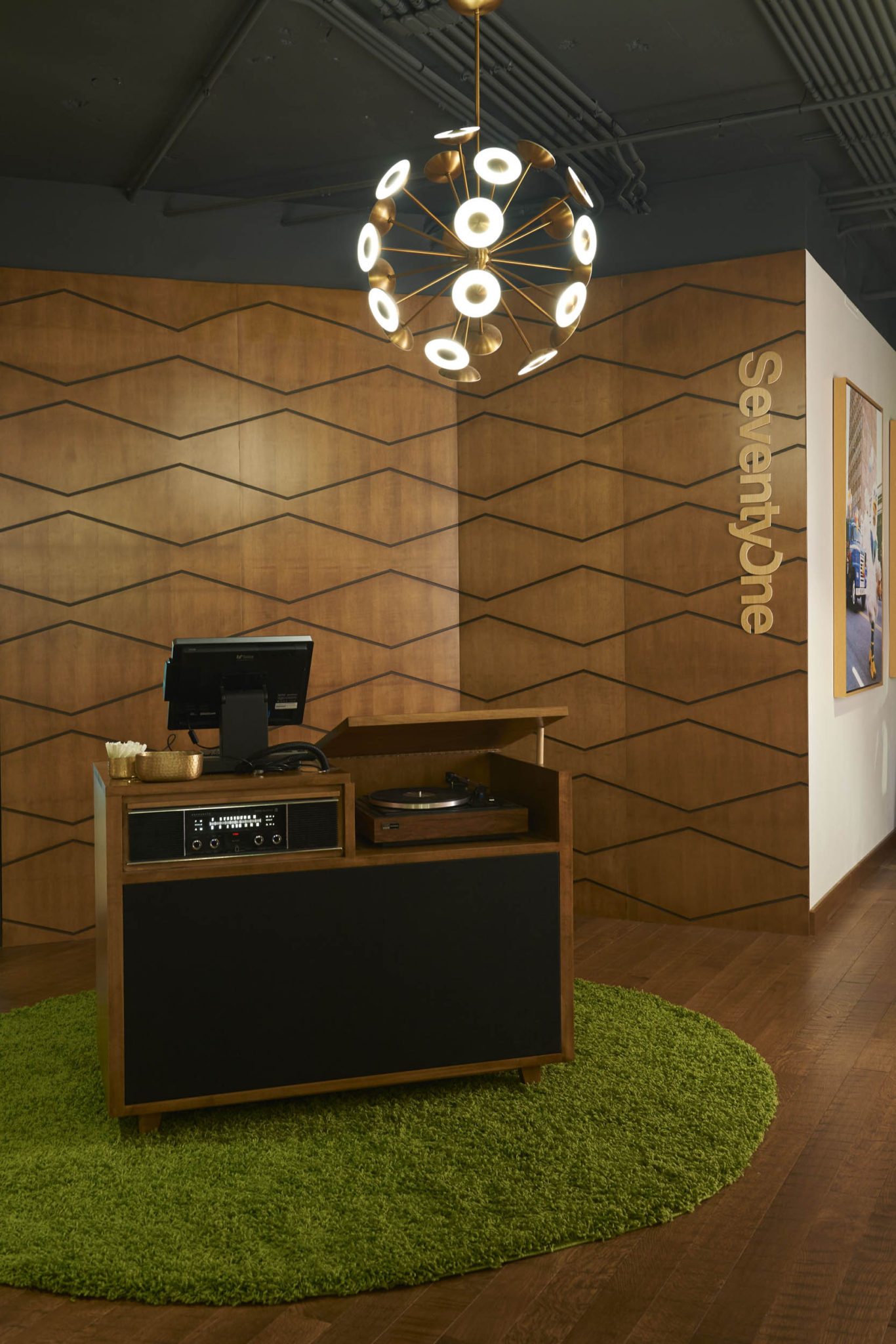
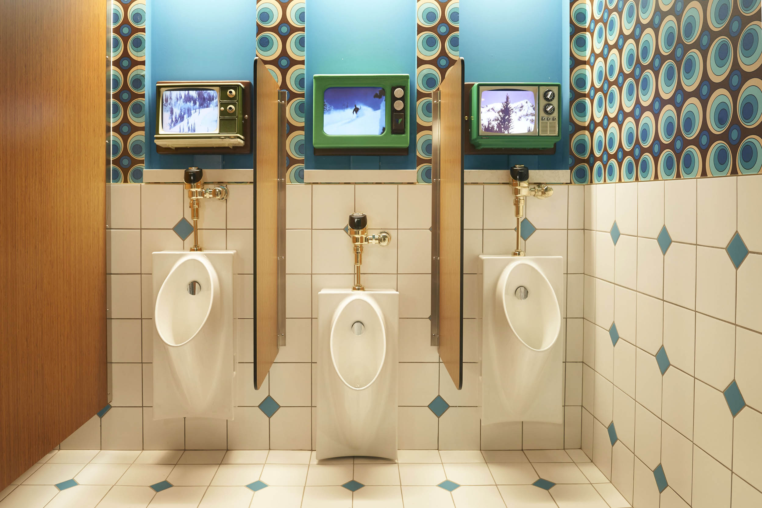
A ’70s-inspired outlier in Snowbird’s Cliff Lodge. Opening-day photos. The Snowbird logo hiding in plain sight. Warren Miller on loop above the urinals. We considered the whole experience.
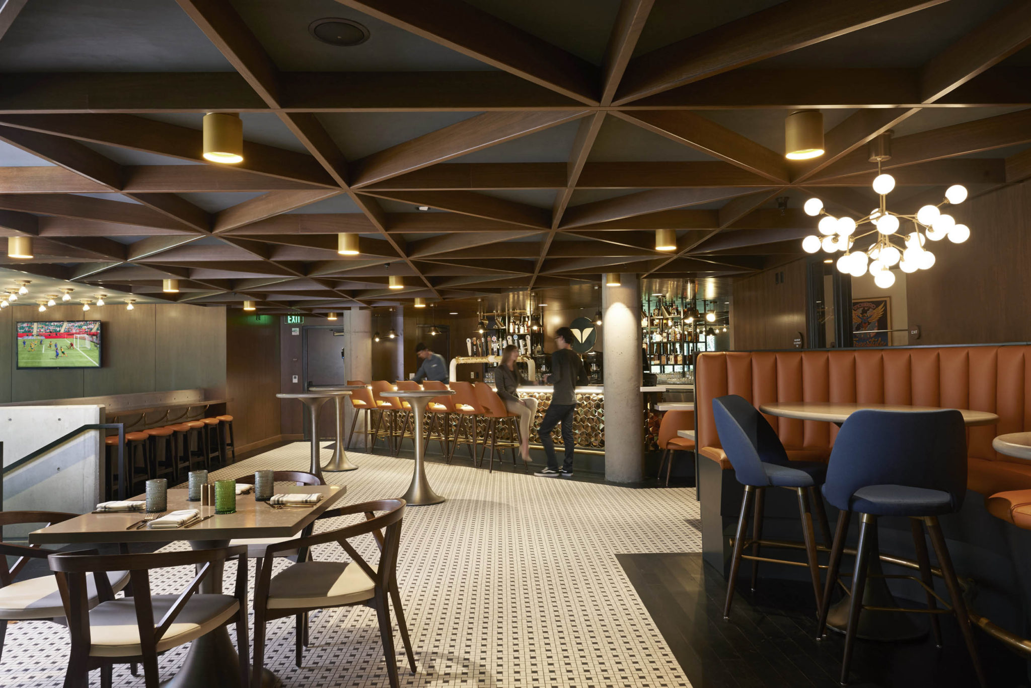
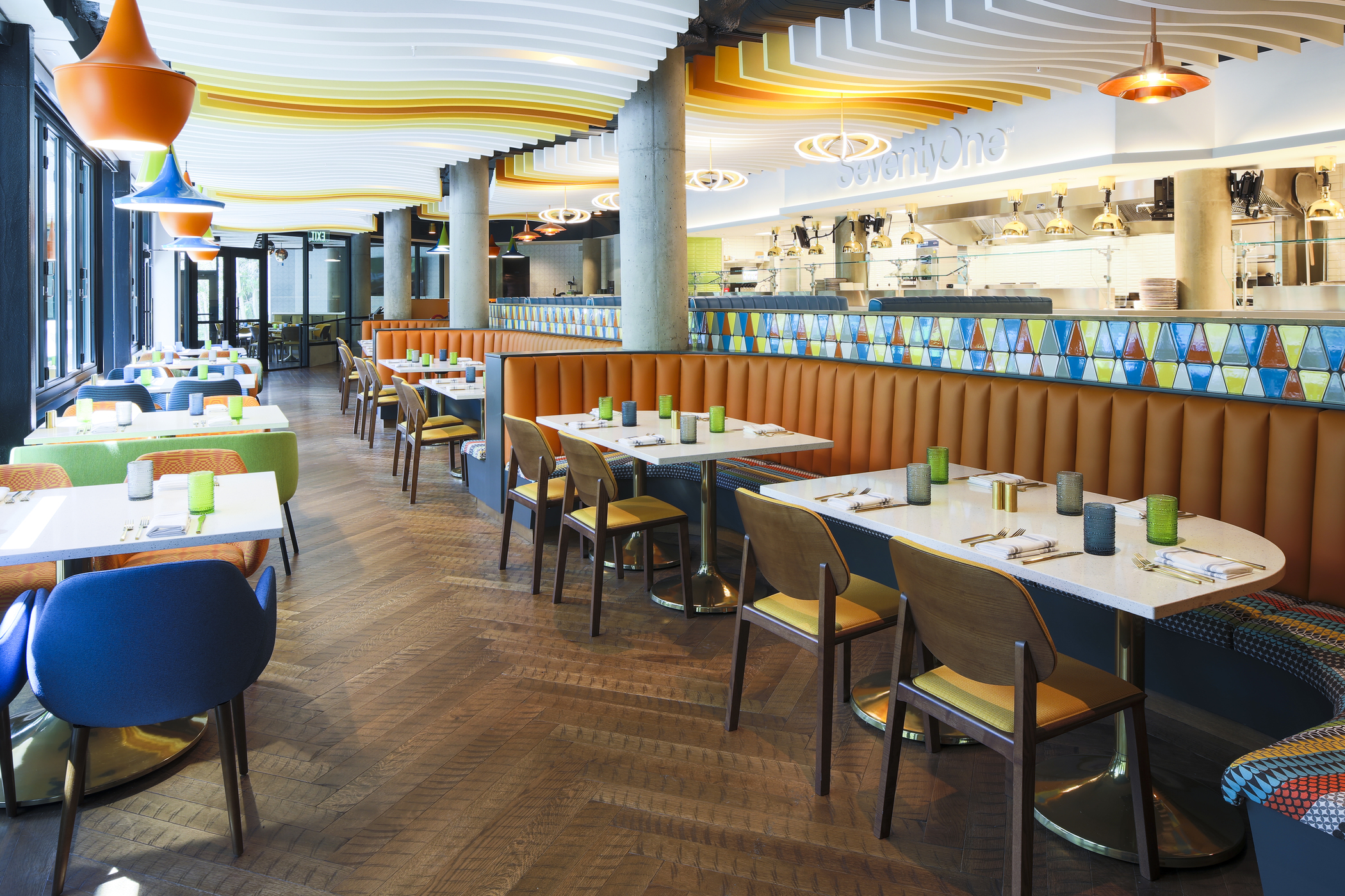
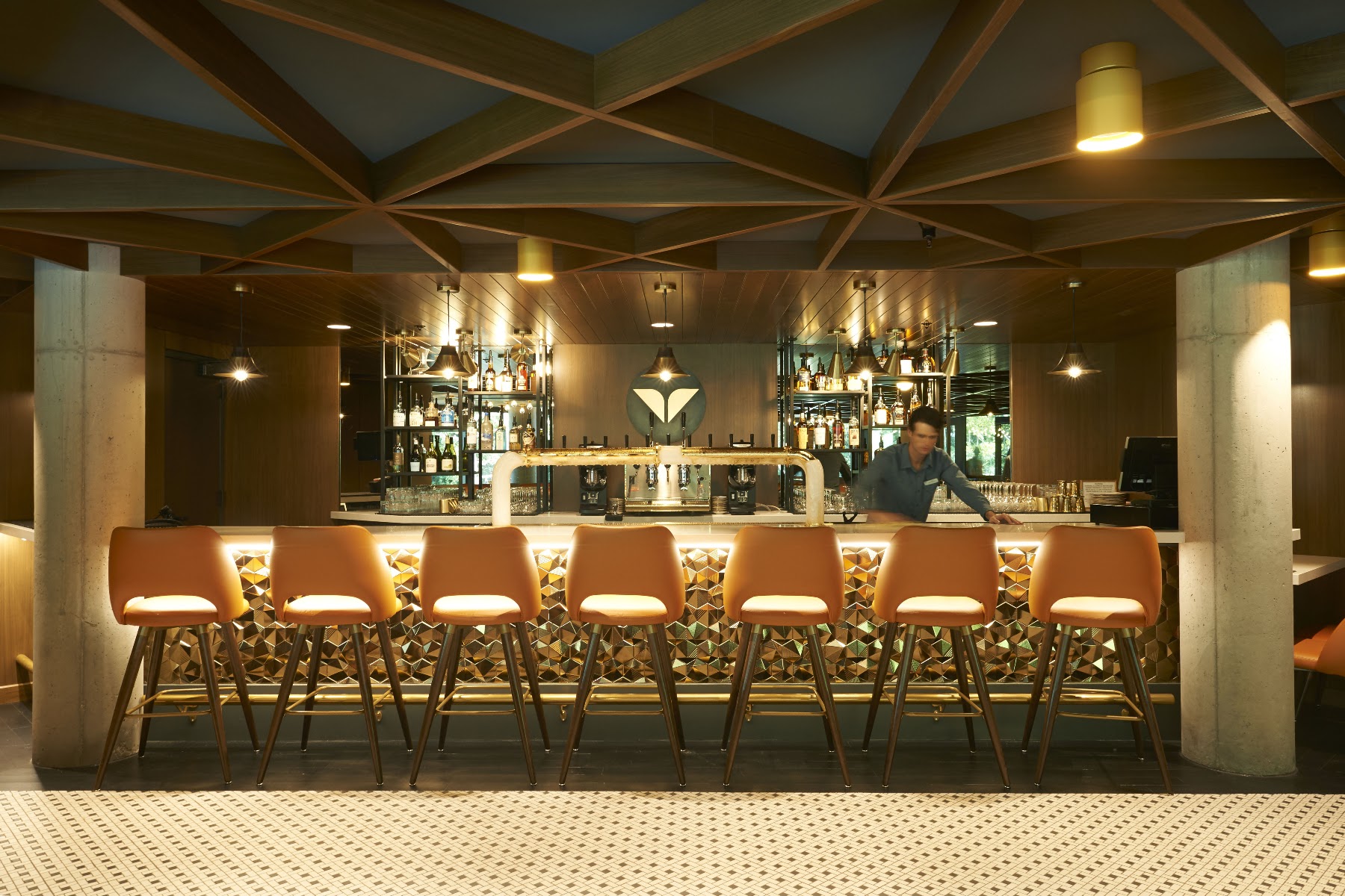
The restaurant was new. Its source material was fifty years old. And the Snowbird logo is in more places than you’d think to look.
BRAND WORLDS / THEN—NOW
Built.At scale.
BOULDERING PROJECT / COMMUNITY + ENVIRONMENT

01 / 15
SCROLL / TWENTY YEARS IN MOTION
THE OPERATING SYSTEM
Ideas need
direction.
Then proof.
The process is simple enough to explain and strong enough to carry a complex project from an undefined ask to a built, working experience.
- 01
Frame the challenge.
Define the real problem, the audience, the constraints, and what success has to feel like.
- 02
Set the creative direction.
Find the central concept and establish the point of view that gives every decision a reason.
- 03
Build the system.
Translate the idea into a flexible visual, spatial, material, and operational language.
- 04
Bring it to life.
Carry the direction through environments, objects, signs, vendors, teams, budgets, and every last detail.
THIS WASN’T IN THE COURSE CATALOG.
I went to school for design, and art direction.
The next twenty years required a somewhat broader interpretation.
Brands, places, teams, and a few things my professors weren’t consulted on.
Condensed into sixty seconds. You’re welcome.
ABOUT TONY
You’ve seen the work. Meet the accomplice.
The résumé makes it look planned.
The backstory is more interesting.
A Bachelor of Fine Arts, fighter jets, chainsaws, agency, tech giant, welding + fabrication, advertising, and a habit of asking questions that weren’t in the brief. Not afraid to be wrong, and have already moved on if I was right.
“Creative Director” has always been easier to put on a résumé/business card than all of that. I simply tell most people I'm a designer, but the longer version explains a few things more...
FOR THE AMBITIOUS, THE UNDEFINED, AND THE SLIGHTLY IMPOSSIBLE.