Project Roles
» Creative Direction » Co-Branding » Theme » Concept Development » Environmental Branding » Brand Touch Points » Wall Applications » Material Selection » Furniture and Textile Selection » Building Materials » Concept Integration
When the accent color matters, and there is not time for “custom” – there is always DIY!
CAMP HALEOUTFITTERS
PROJECT OVERVIEW
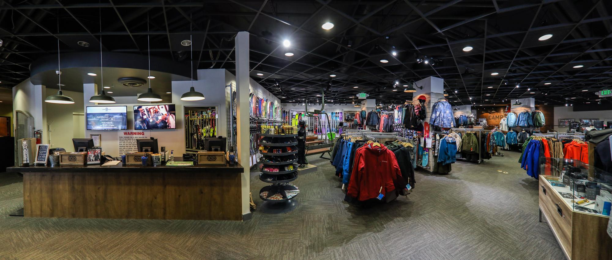
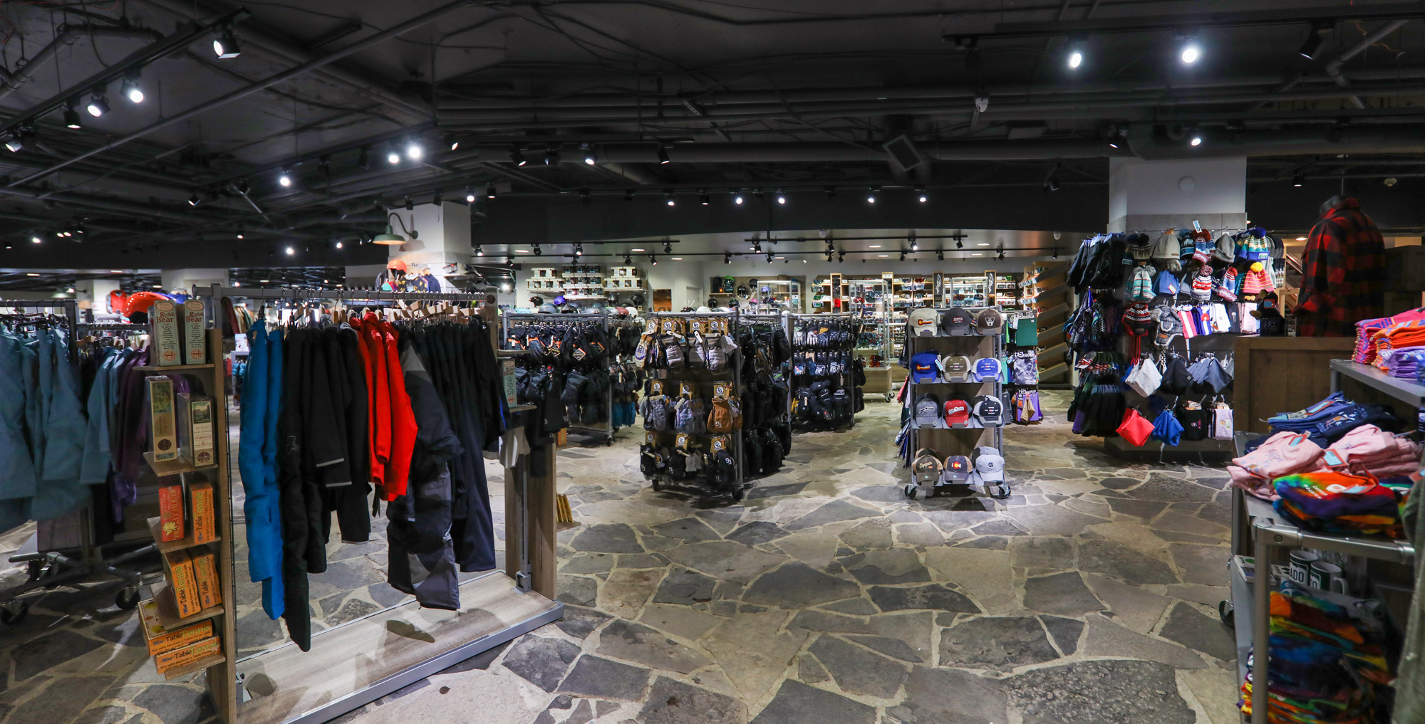
Every project has its challenges and this one was no exception. A major retailer was set to take over the 3,900 square foot retail facility located in the heart of the Copper Mountain Center Village. With just 90 days until the ski resort was set to open, they ended up backing out. In the wake of their departure, we were left with a gutted store and a lot of work ahead of us.
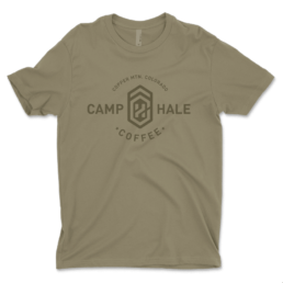
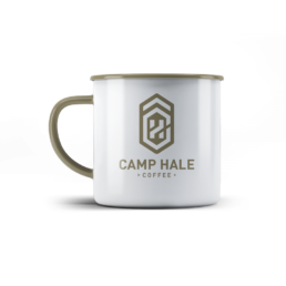
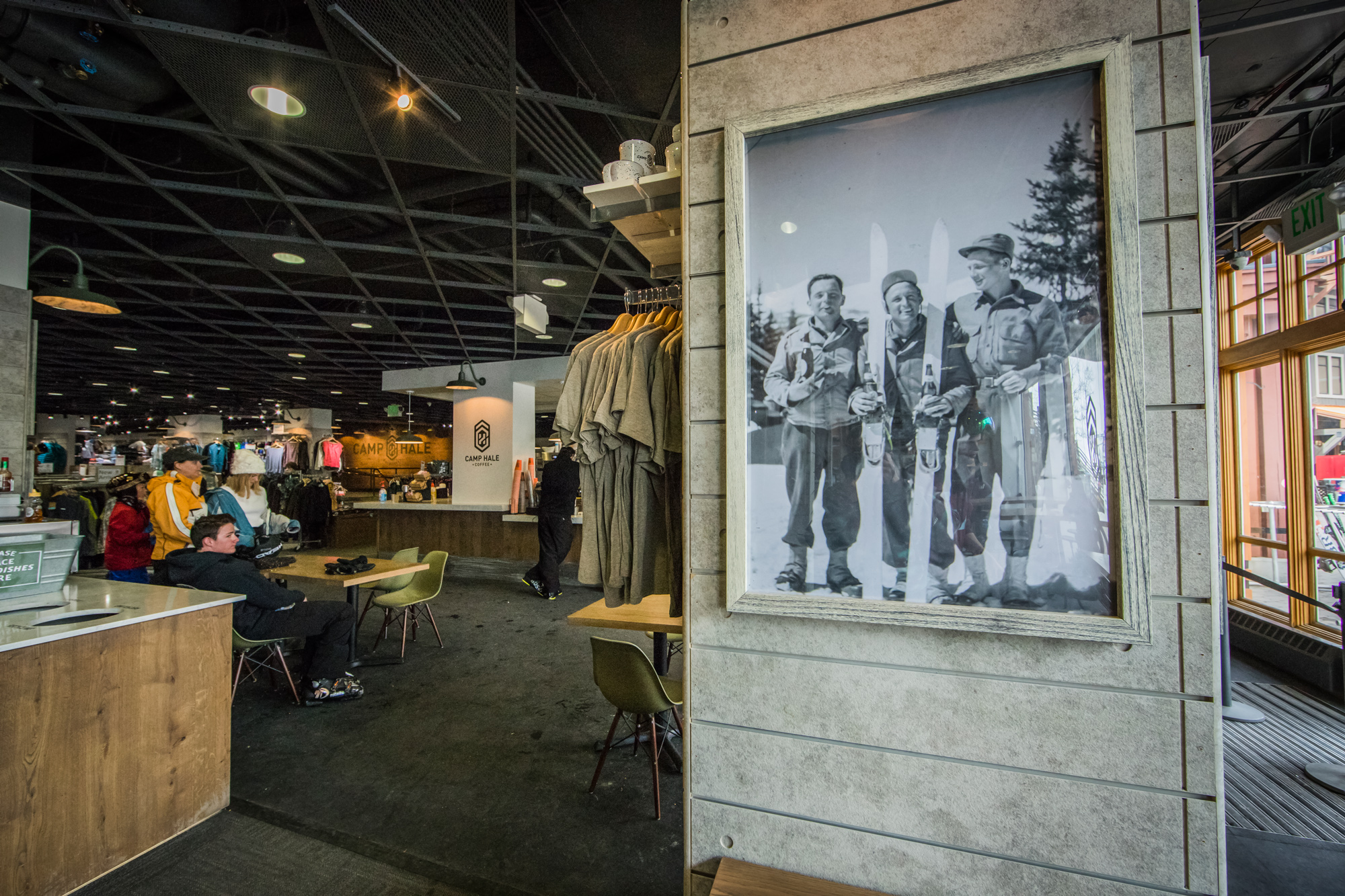
In parallel to this project, I had been working with the Food & Beverage Director for the resort to reimagine what the environment, branding, and experience would be for the coffee shop and grab-and-go located in the core of the retail footprint. We were working off the previous name “Camp Hale Coffee.” Camp Hale, between Red Cliff and Leadville in the Eagle River valley in Colorado, was a U.S. Army training facility constructed in 1942 for what became the 10th Mountain Division. It was named for General Irving Hale and was at an elevation of 9,200 feet above sea level. It was an alpine camp used to train soldiers on how to navigate mountainous terrain that would aid in the invasion of Europe.
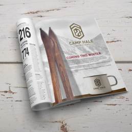
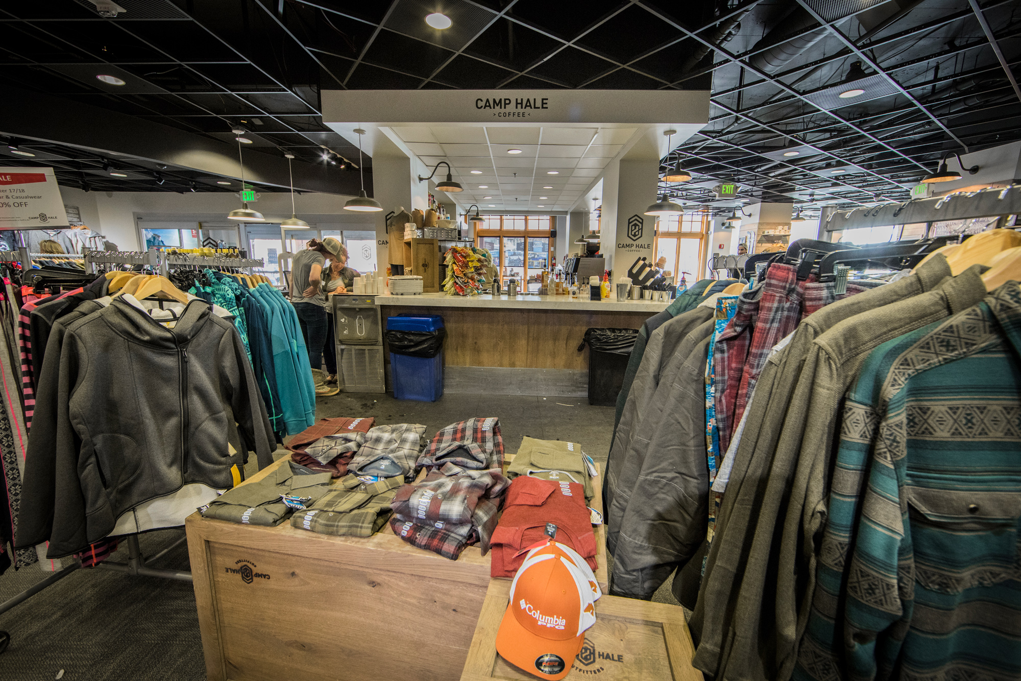
The decision was quickly made to call the retail space Camp Hale Outfitters and would compliment Camp Hale Coffee, located within the retail interior.
PROJECT GOALS:
-
- Transform the dated Copper Sports retail facility into a proprietary themed retail center
- Create an environment that is conducive to high-end retail and ski and snowboard demos
- Have the coffee shop ‘Camp Hale Coffee’ become the epicenter of the retail experience
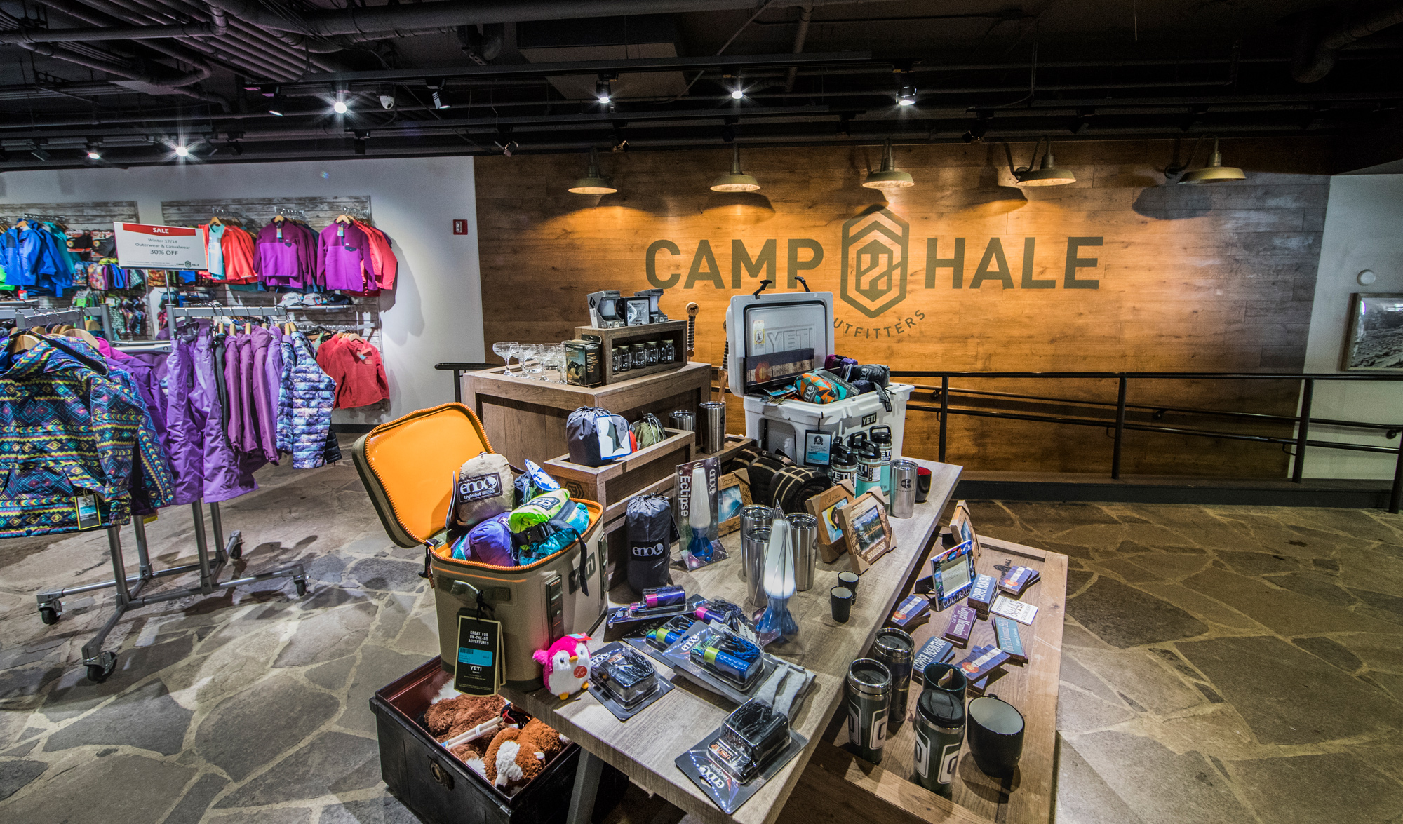
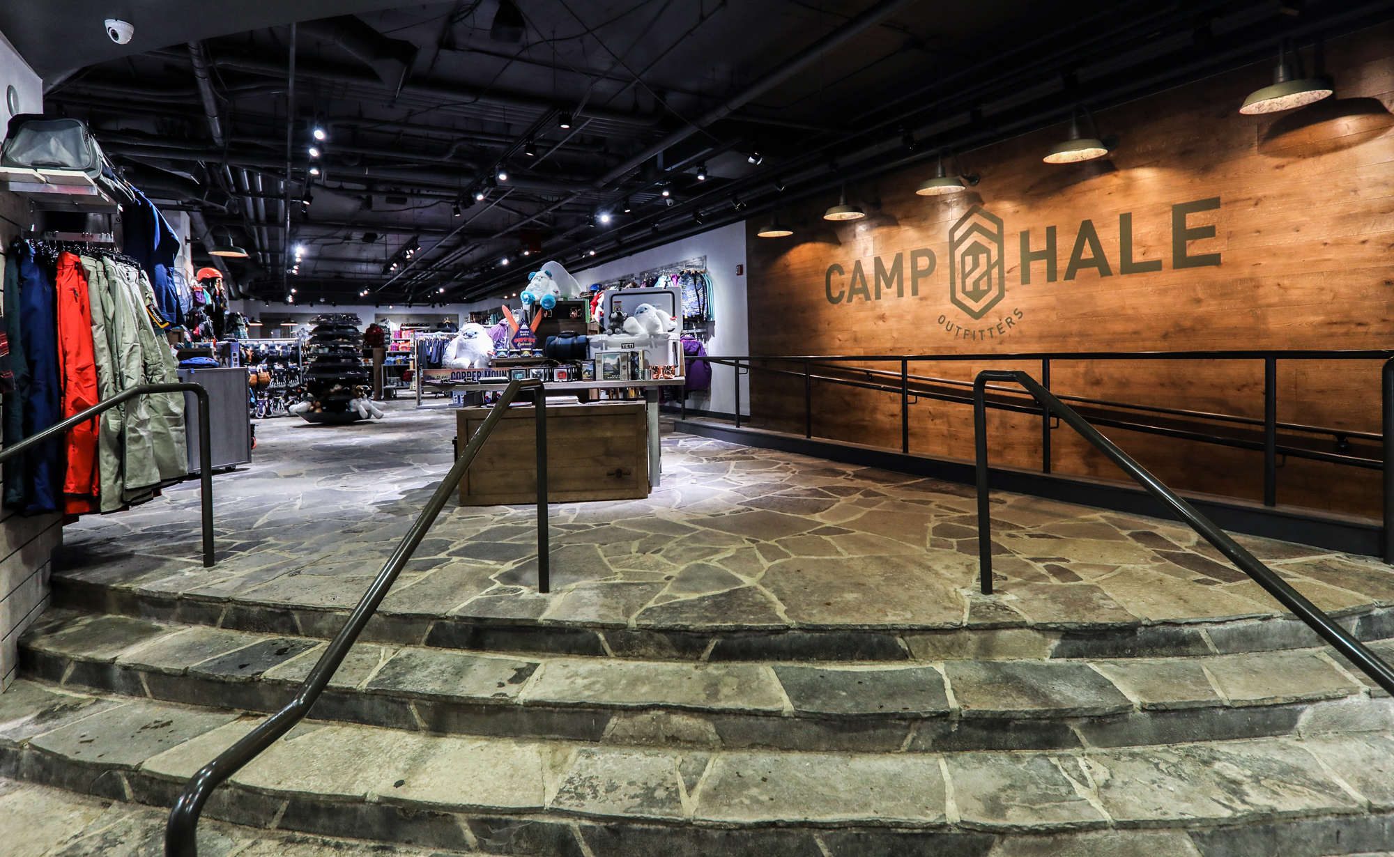
The goal of the interior space was to put a modern twist on what Camp Hale would have been in the 1940s leading up to the invasion of Europe. The color and material pallet was contrived from the soldiers’ white uniforms, cognac leather found on their uniforms and equipment, olive drab green, rustic white oak, and concrete.
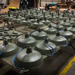
The decor for the interior came from historic photos that were pulled from the 10th Mountain archives, specialty Slatwall, a rustic white oak accent wall with wainscotting, as well as a decorative lighting package that became a running joke for years to come. I wanted to use olive drab green as an accent color to pull the theme together, but I couldn’t find what I was looking for so ended up singlehandedly painting over 100 gooseneck and pendant lights.