BRAND IDENTITY
Copper Mountain Environmental Wayfinding Transformation
What started as a simple resort signage audit became a massive overhaul of the entire brand ecosystem. Unifying over three decades of brand identities, colors, incoherence wayfinding, and rethinking the entire consumer experience were just a few challenges of this project.
481
CUSTOM DESIGNED SIGNS
4
TIER 1 MONUMENTS
1.8
MILLION IN CAPITAL ALLOCATION

INSIGHTS
Preexisting color palette represented several eras of change in color, materials, typography, and new development, as well as short (banner) and long (monument) term elements.
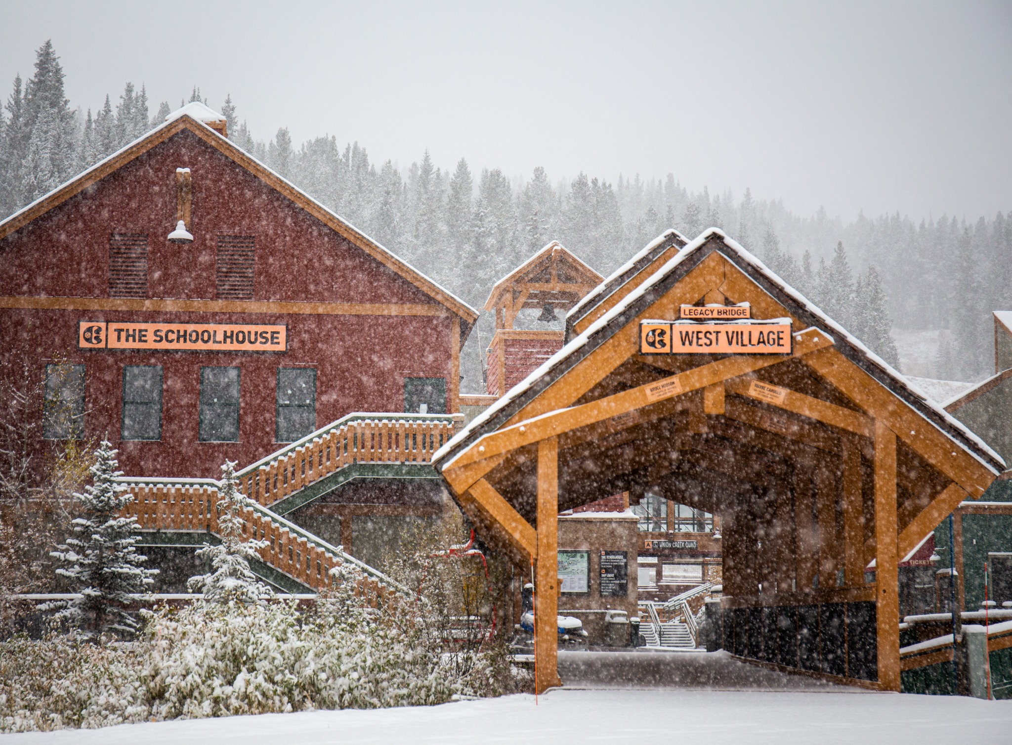
Many different departments across the resort created their own signage resulting in an eclectic collection of ID.
This is not just an exercise in replacing signage.
OPPORTUNITIES
Create a unified palette that can apply across different backgrounds, materials, and structures to align environmental brand identity.
Provide strategic vision to all departments within the resort to align responsibilities with one vision and direction.
There is new infrastructure, painting, and tear down that is going to be required to unify the brand experience across the resort.
EXECUTION
This project would lay the groundwork for future capital allocation and set the tone for the resort aesthetic for decades to come. It became the backbone and filter for aesthetic decision-making as well as driving the environmental and design ecosystem for the resort and village of Copper.
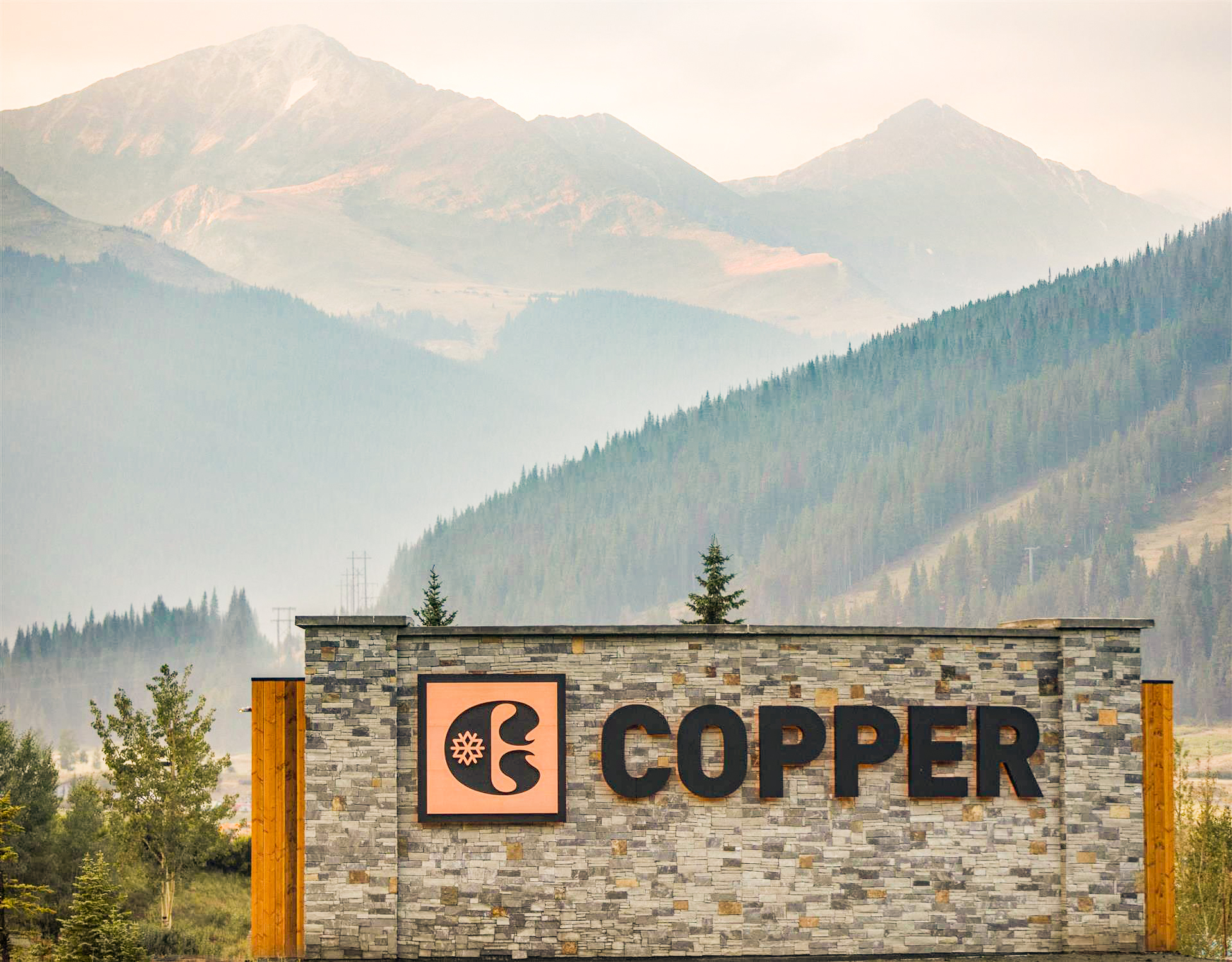
The material selection I chose for this project was .25″ plate copper, Douglas fir, dry-stacked limestone, and anodized aluminum. The color was derived from material selection and would help create consistency. In addition to the material selection, we felt very strongly that there needed to be a delineation between the east, center and west villages. Due to operational constraints, I chose to go with a cantilevered design with a linear LED gooseneck light shining down on plate copper. I also went through endless design revisions with the county trying to update the front entrance monument. Where we landed was with a 67′ wide curvilinear structure that stands 22′ tall and boasts halo-lit protruding copper letters. When standing close to the wall it is quite enormous, but the Rocky Mountains are the backdrop so it becomes quite dwarfed.