
Project Roles
» Creative Director » Brand Identity » Photography » Marketing Collateral » Fabrication » Signage » Print Collateral
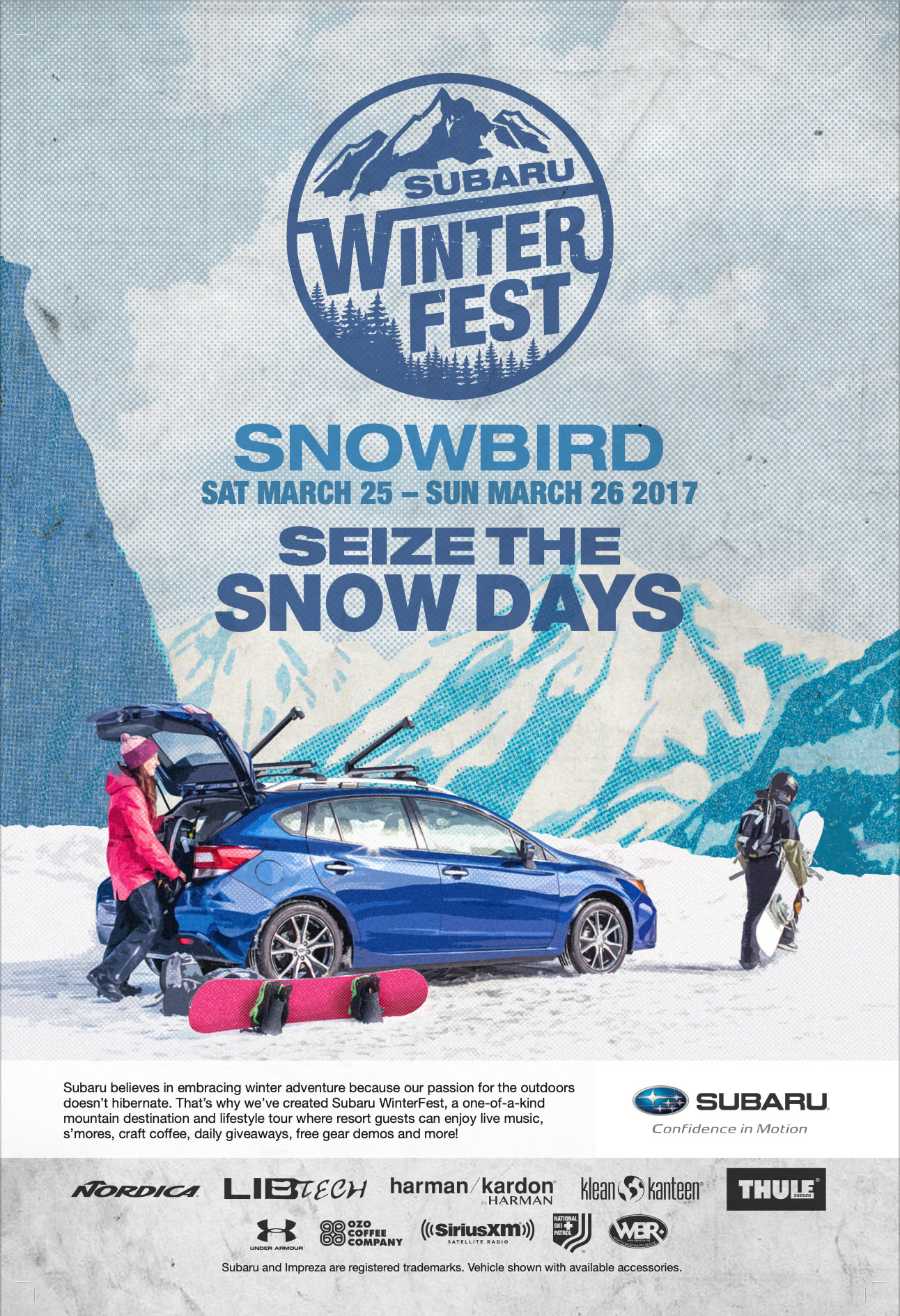
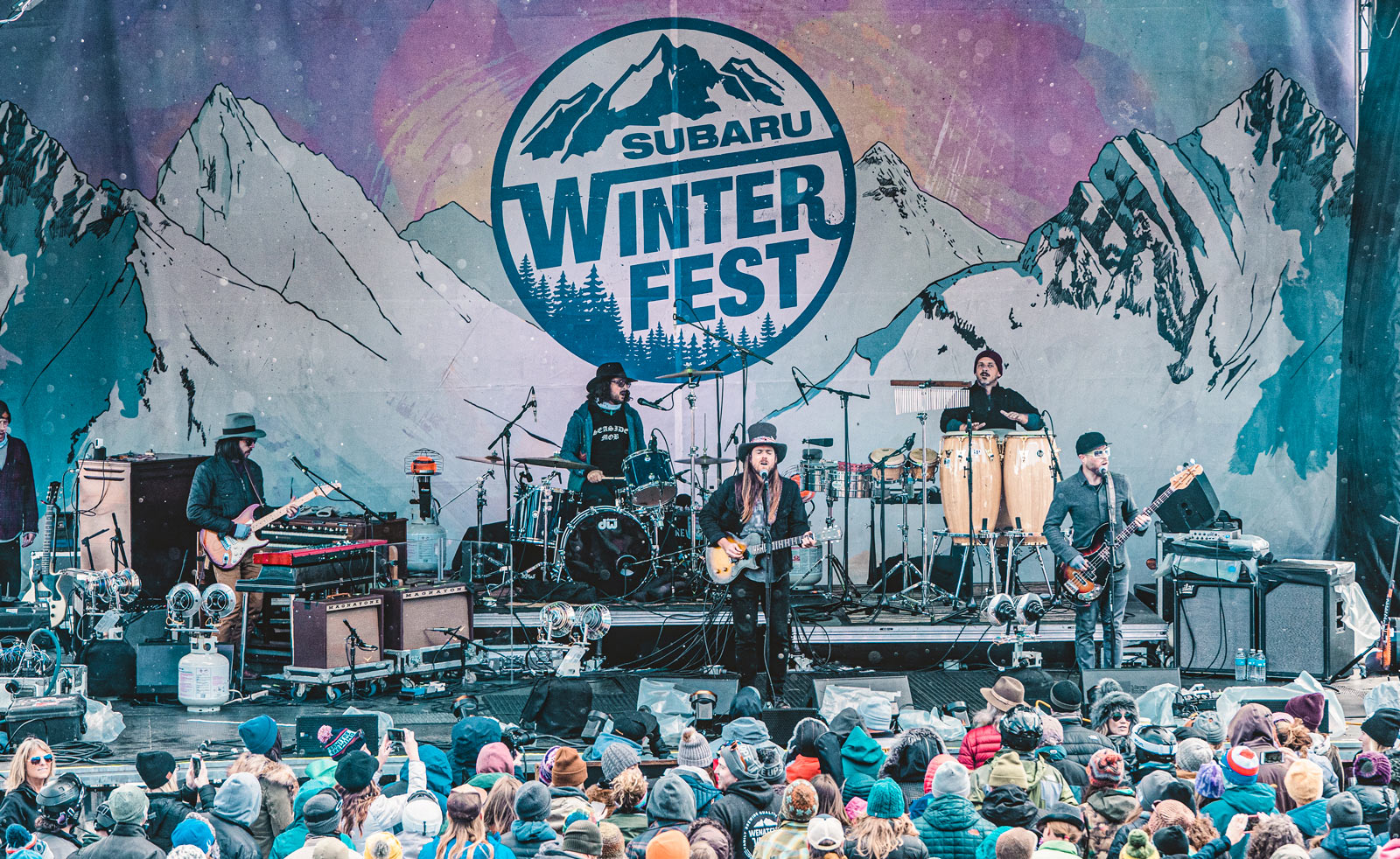
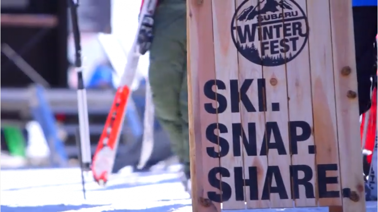
Subaru Winterfest
PROJECT OVERVIEW
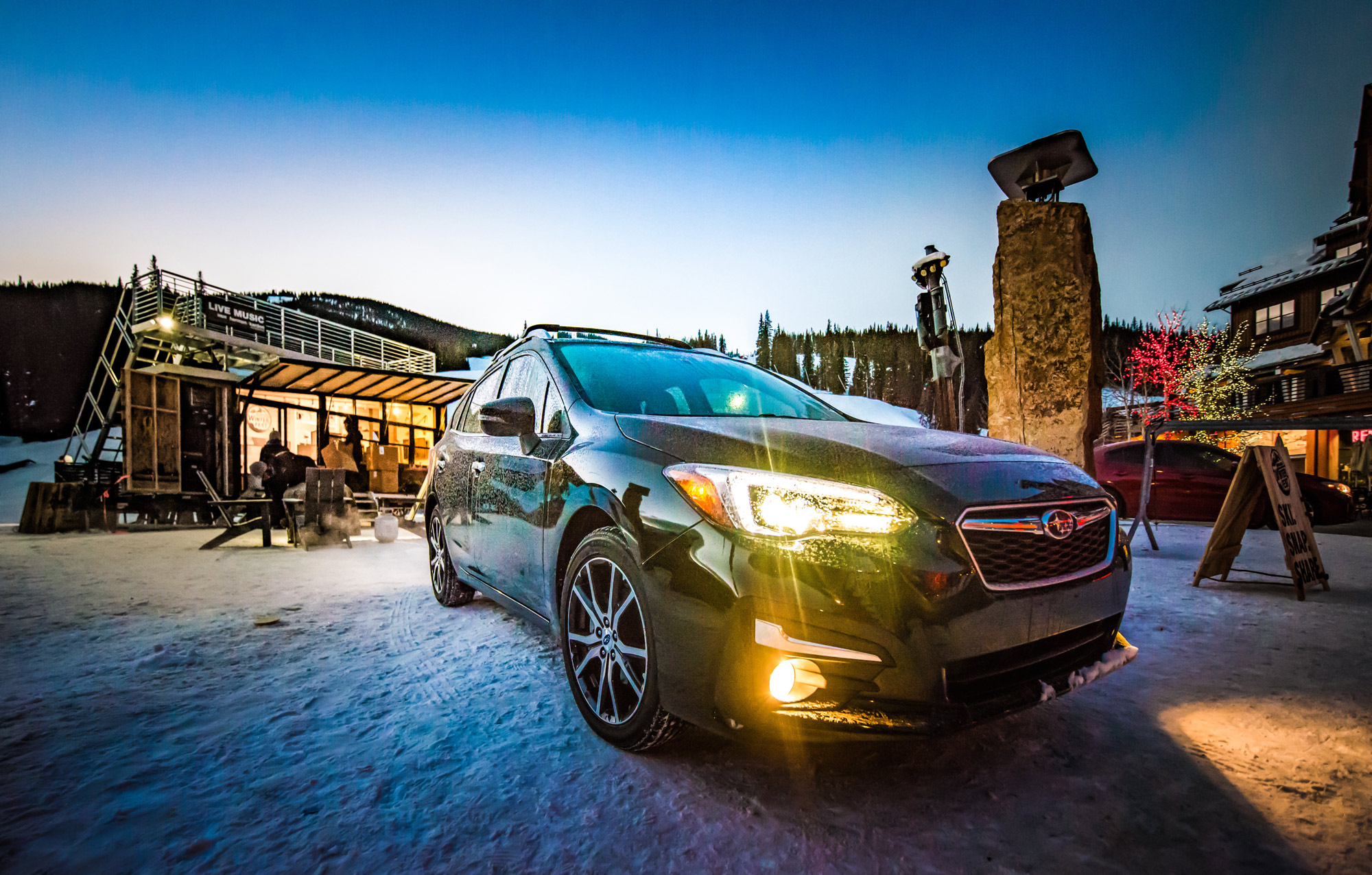
I worked directly with the team at Subaru of America to come up with a winter activation focused on driving customer leads. The tour traveled to multiple winter resorts around the US and featured live music, demos, and showcased other brand partners of Subaru.
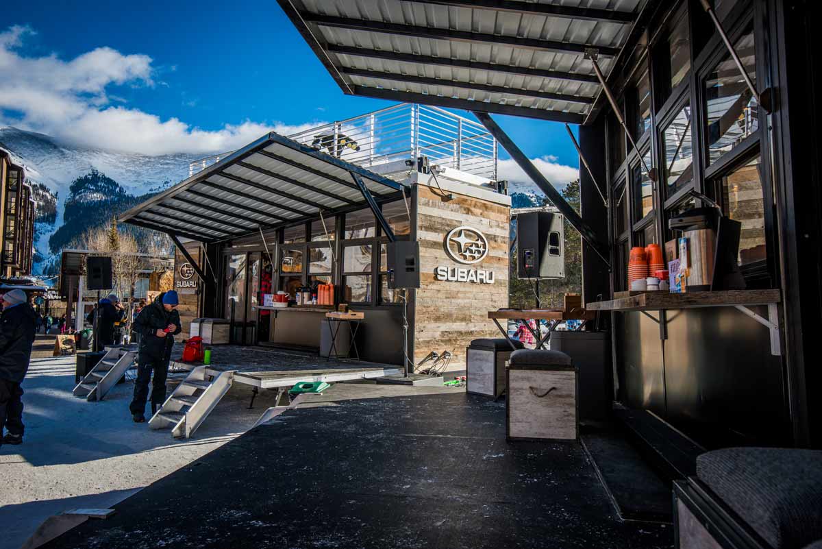
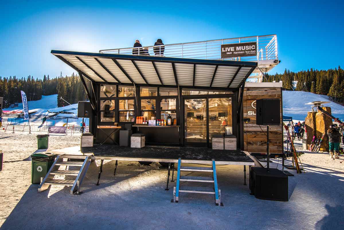
For this project, I developed a set of mirrored, commercial-grade mobile activations that were loosely based on a tiny home. Working through operational constraints for winter conditions, I developed fold-out awnings, decking, and a rooftop area designed for live music.
Part of creating the activation was also developing the brand itself. The client was very insistent on using Helvetica as that is part of their corporate identity. So I created a logo that was both rustic and mountain-centric while following their brand guidelines. In order to further bring the brand to life, I created posters, A-frames, tents, and other collateral, as well as photographing the units for marketing.
A flyover of the original conceptual rendering I created
